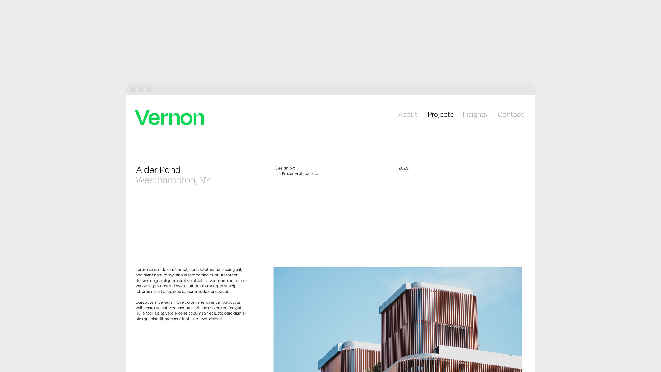
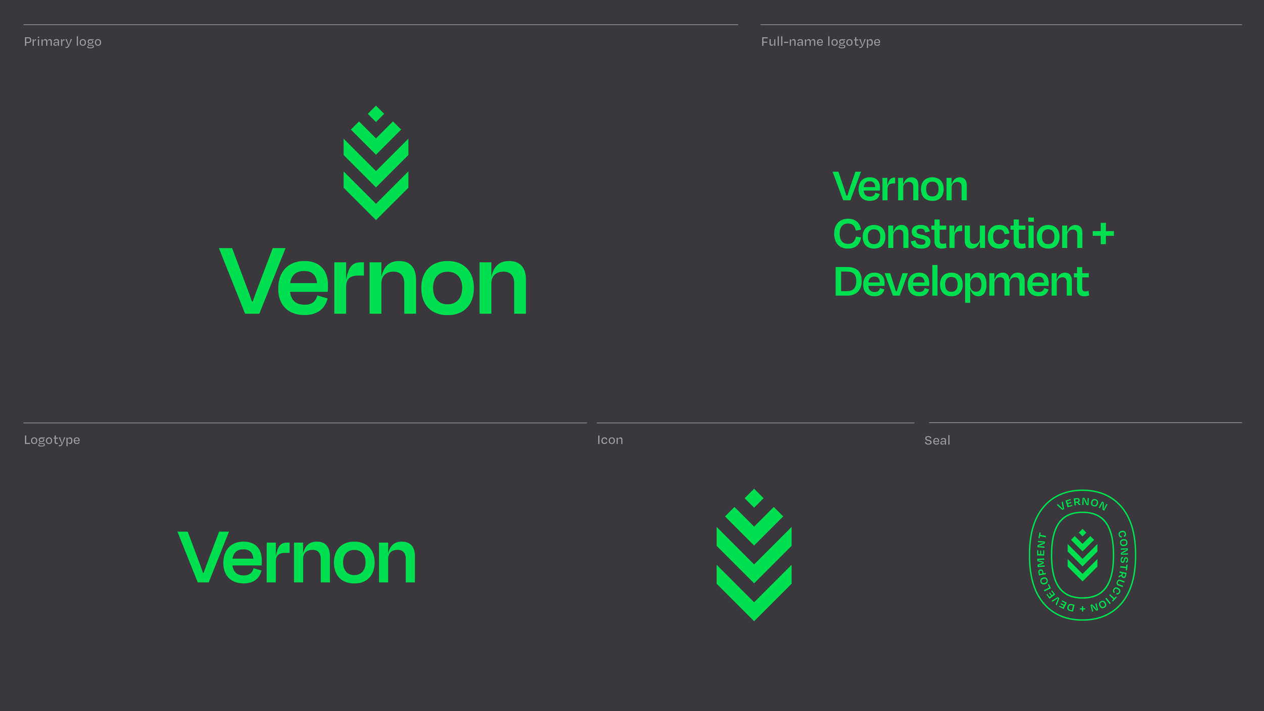
Vernon
→ This visual identity was created for a new type of construction & development company. One that combines traditional methodologies with forward-thinking ideas, and sees value in treating employees as partners and collaborators rather than temporary help.
-
Scope
Branding
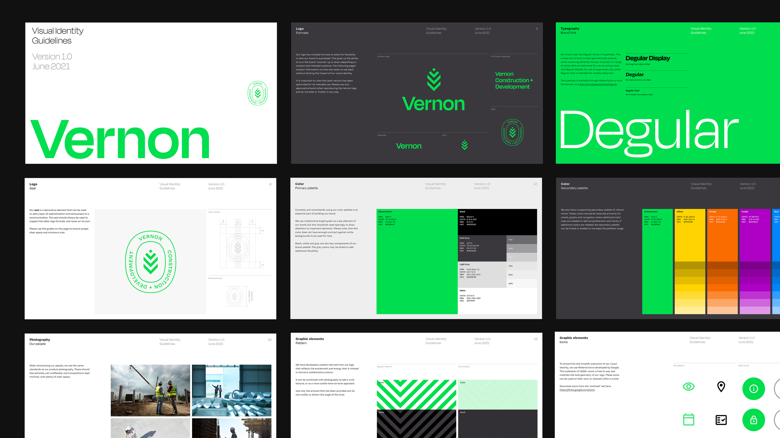
Visual Identity
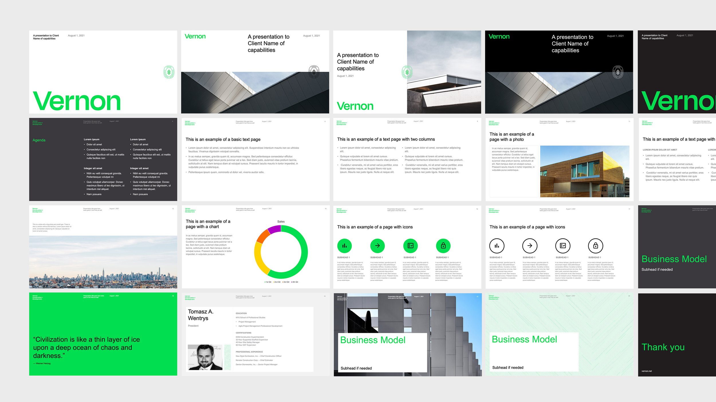
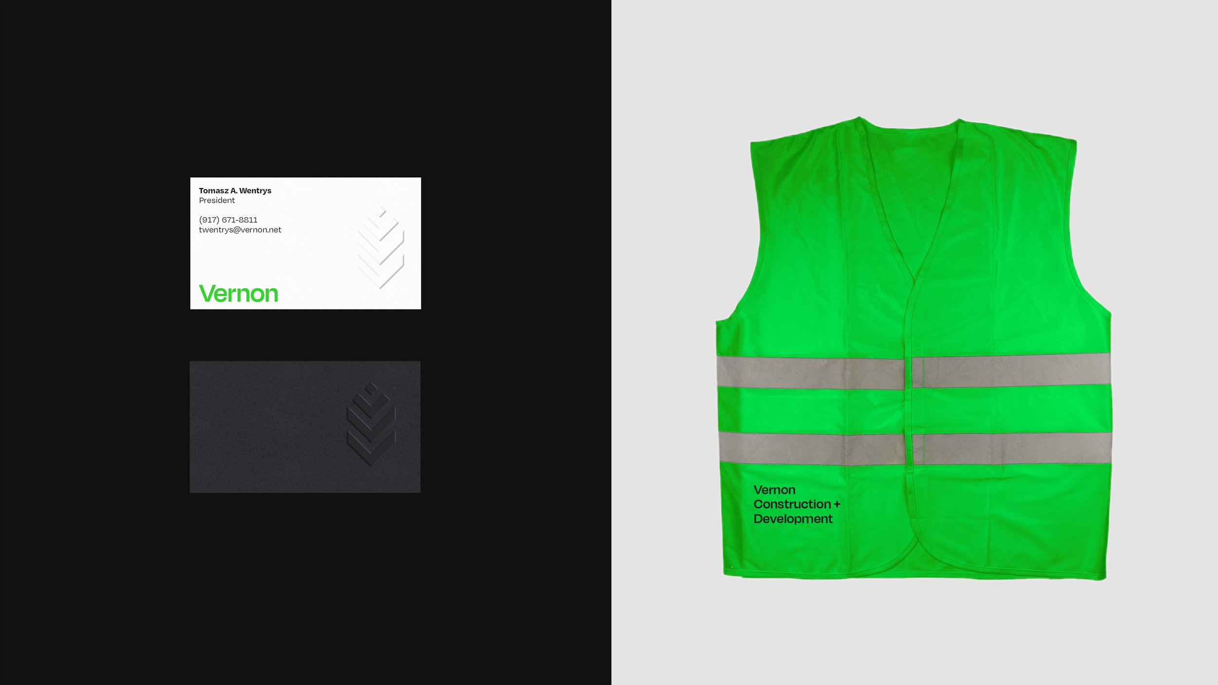
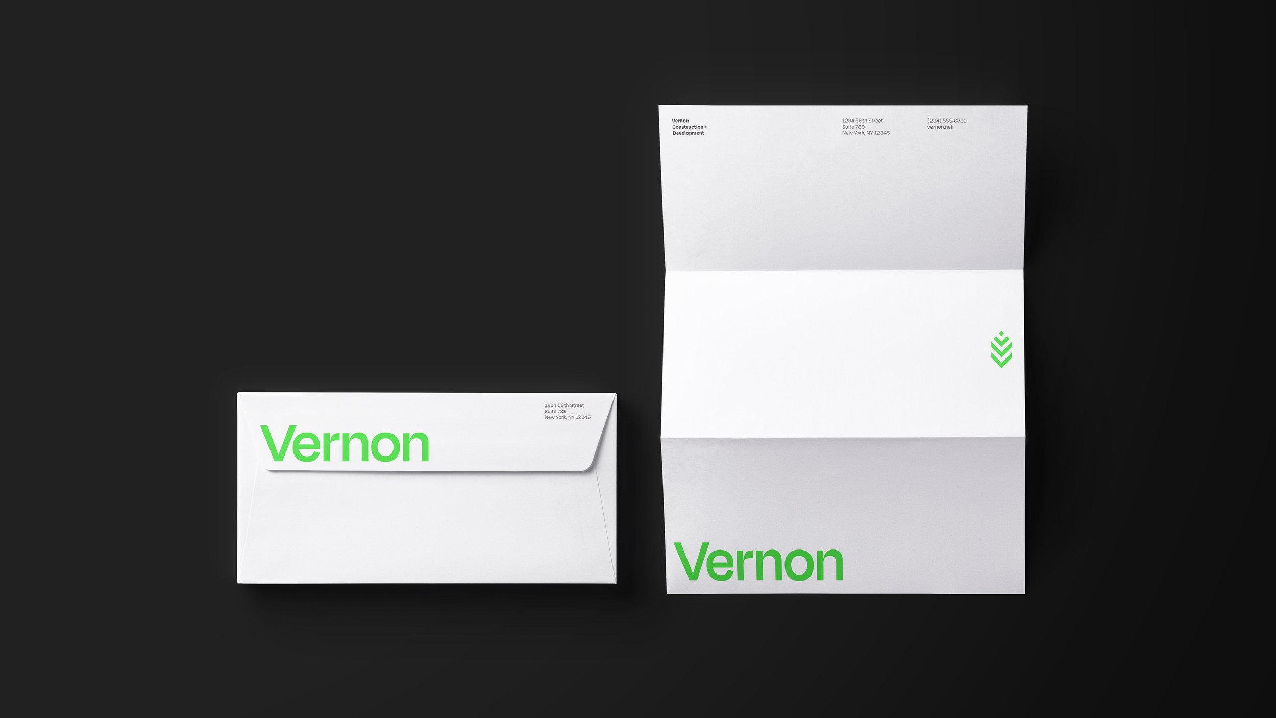
Digital
Print

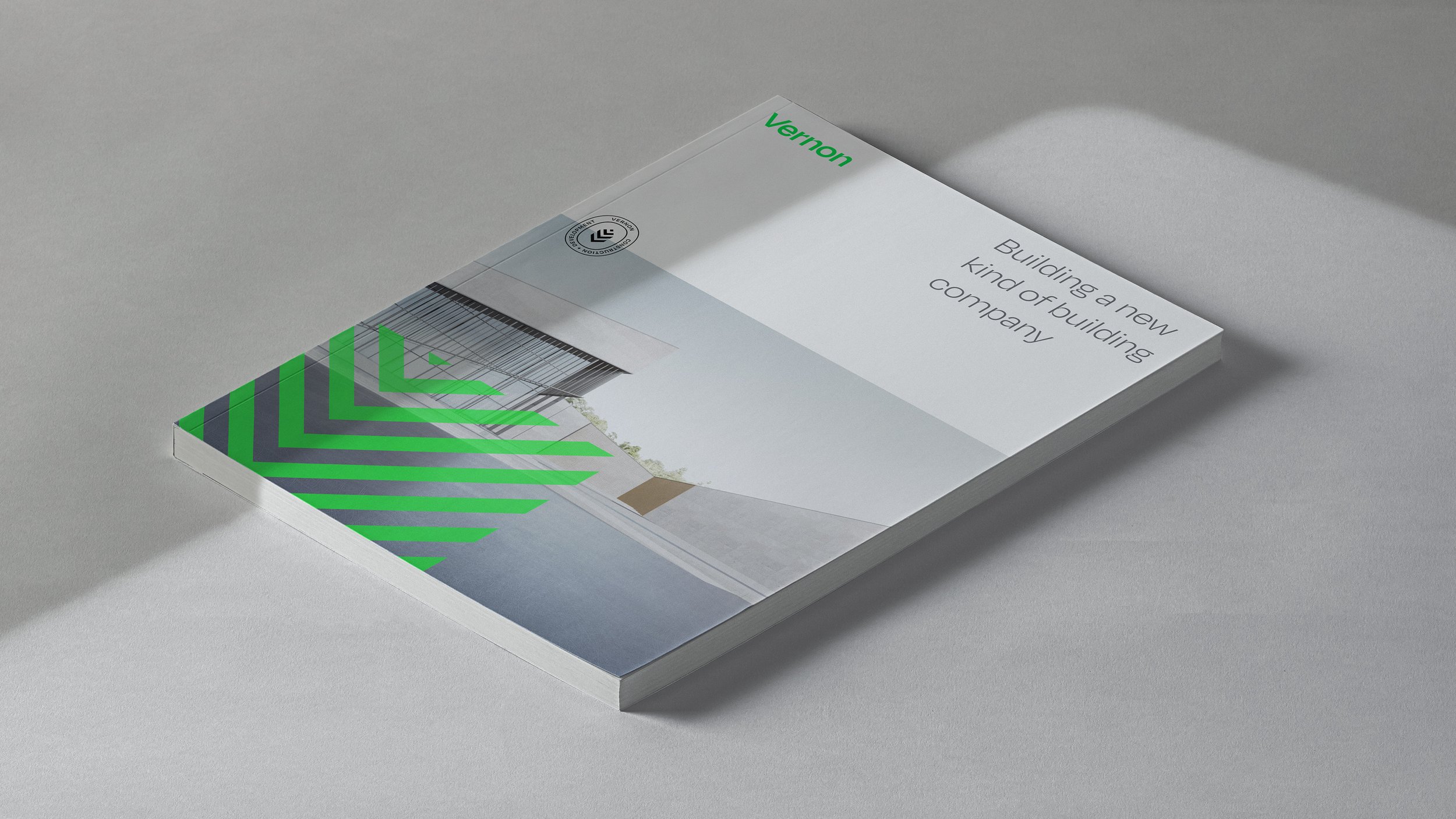
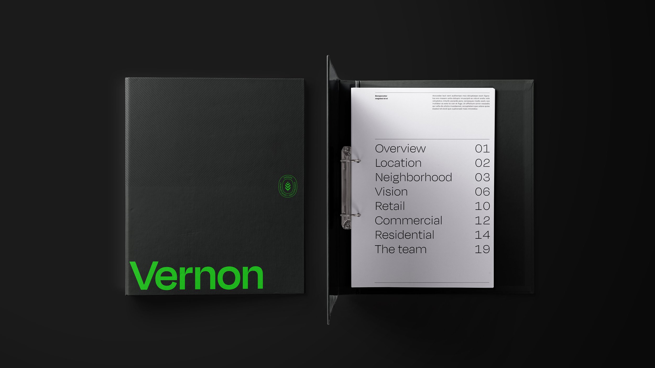
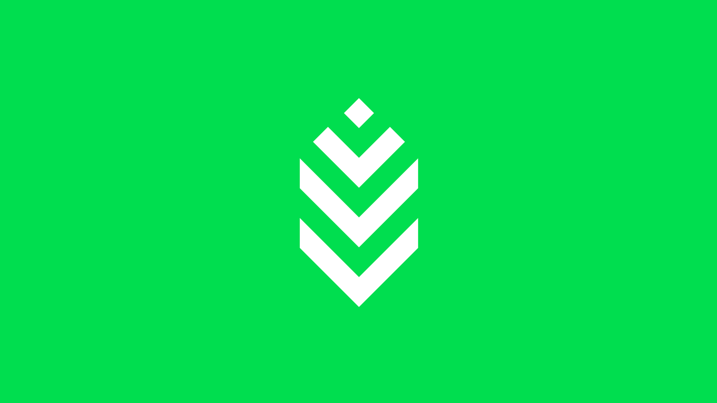
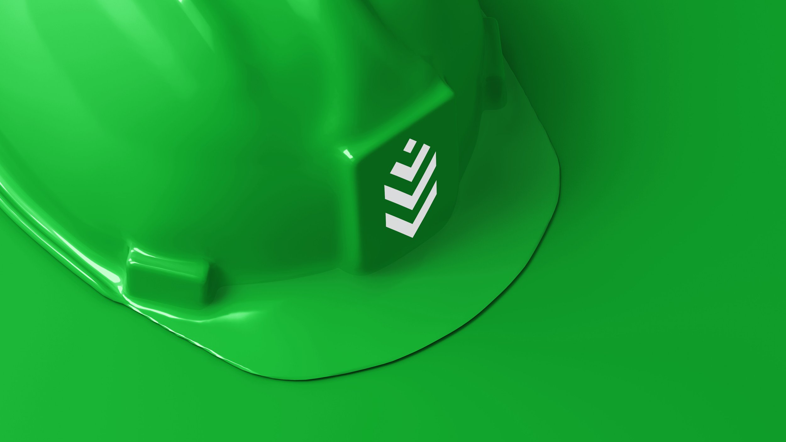
The logo is derived from three primary influences: The shape of the letter V, the forms seen in technical, isometric building plans, and the color and structure of the leaves of the Alder tree. The first two are straight-forward, but the word “Vernon” originates in French language and means "of the alder tree" - providing a link between the chevron shapes, and informing the construction of the brand mark.
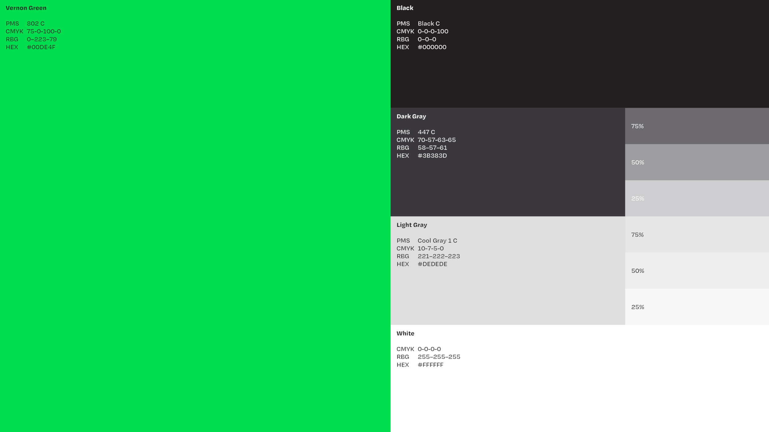
Palette

Photography


Typography
Patterns