Wills Eye
Hospital
→ The people at Wills Eye Hospital make great clients. They know that they are the best in the industry and they want their materials to reflect that. This series of reports showcases their unflagging spirit and willingness to do something truly different within the world of healthcare.
-
Scope
Print
Credits
Created at Addison
Recognition
⮡ Type Directors Club Communication Design 2013
⮡ Communication Arts Design Annual
⮡ Graphis Design Annual 2016: Merit
⮡ Communication Arts Typography Annual
⮡ Graphis Annual Reports 2014-2016: Gold

Part 1
Part 2

Part 3


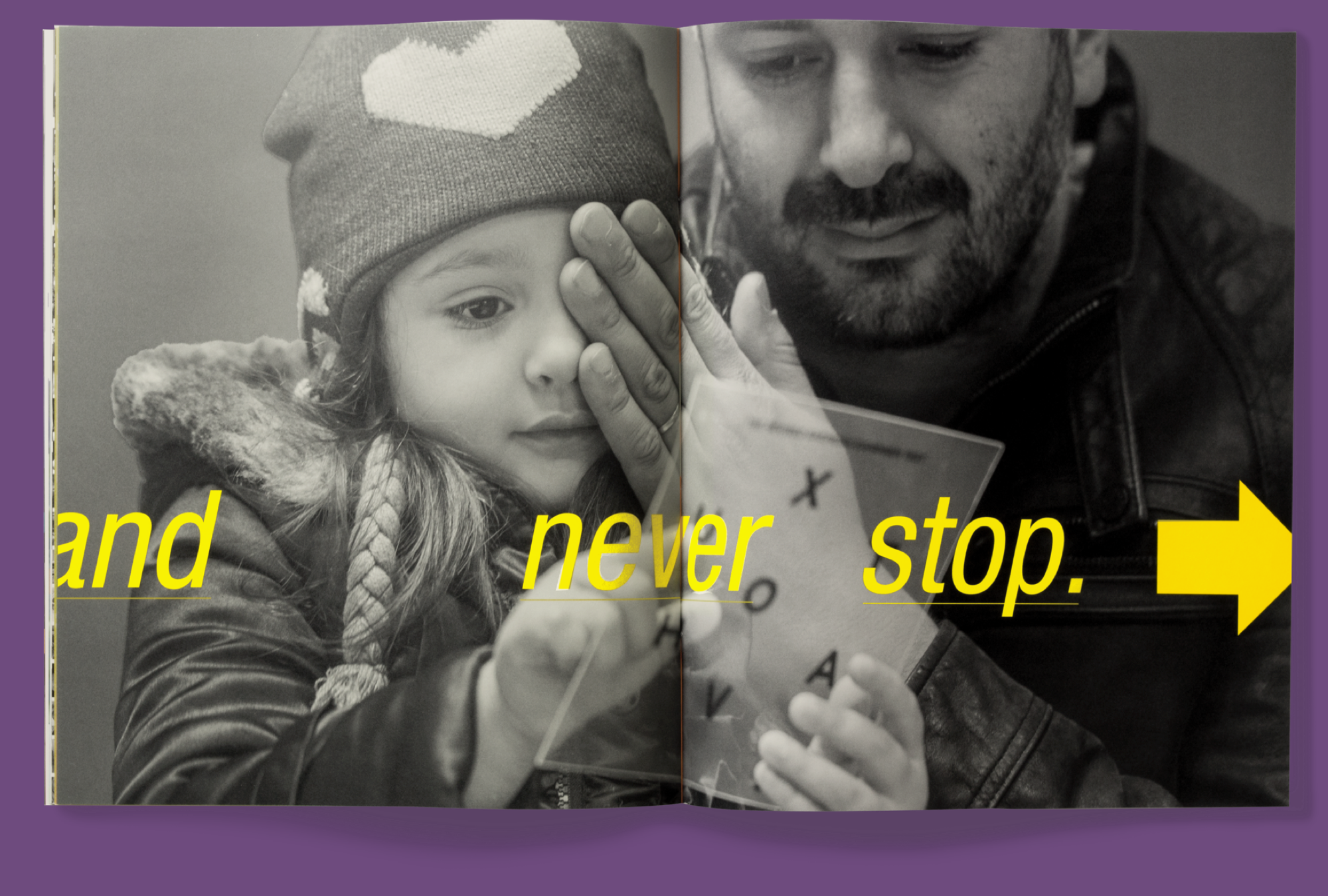
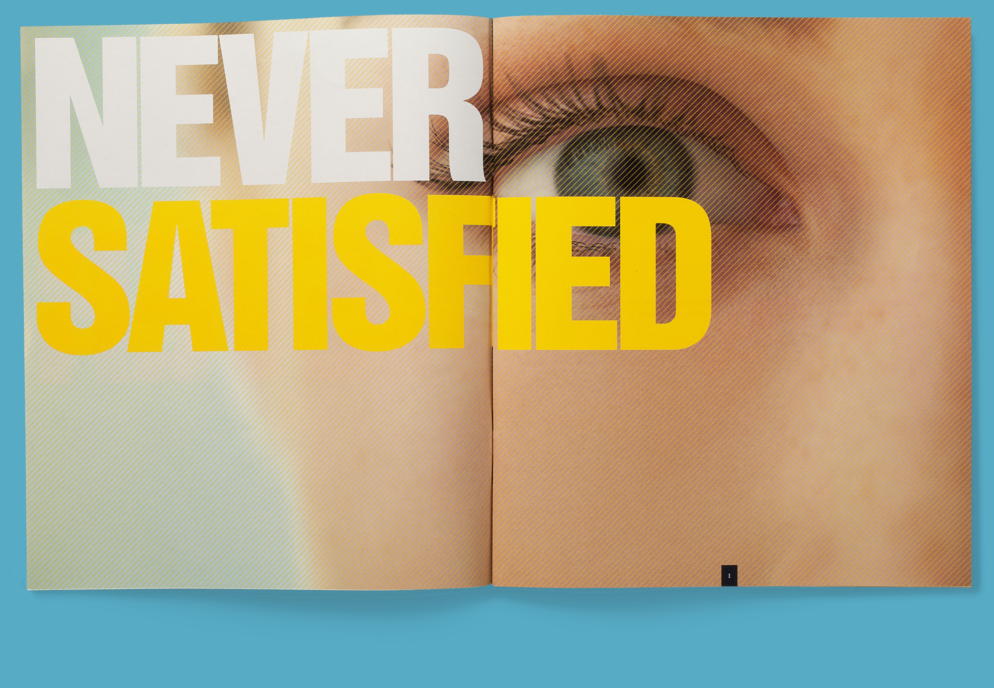
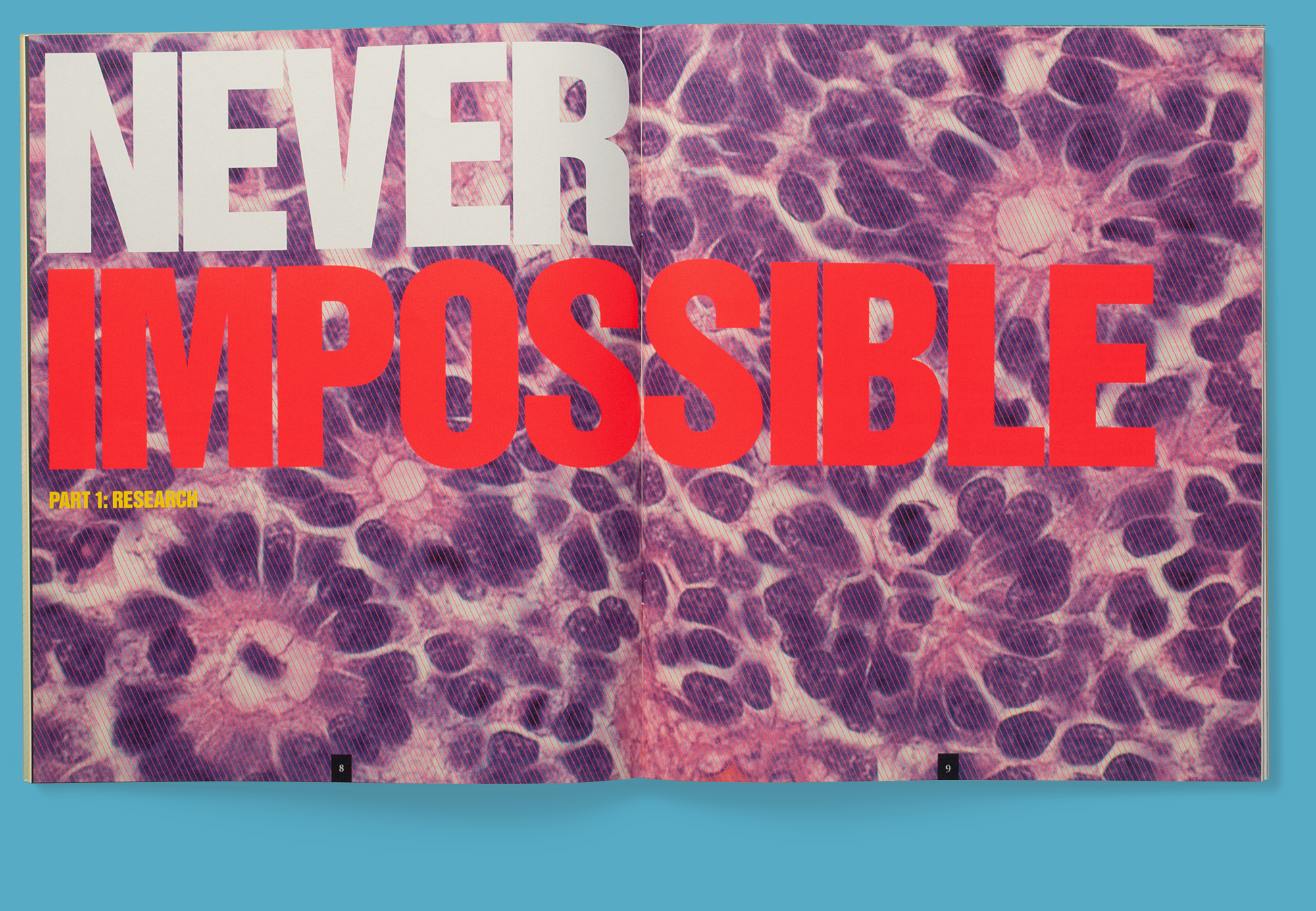
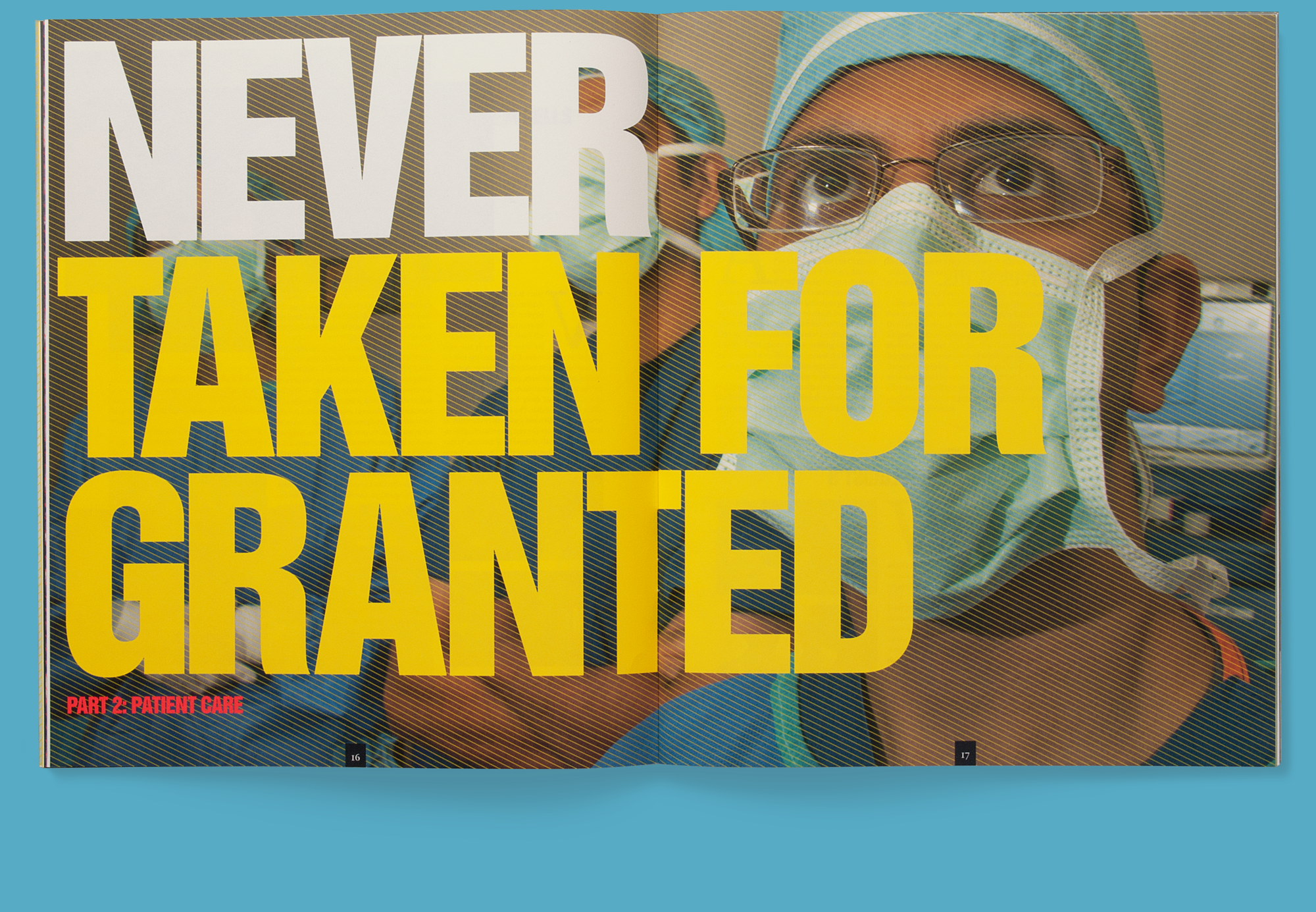
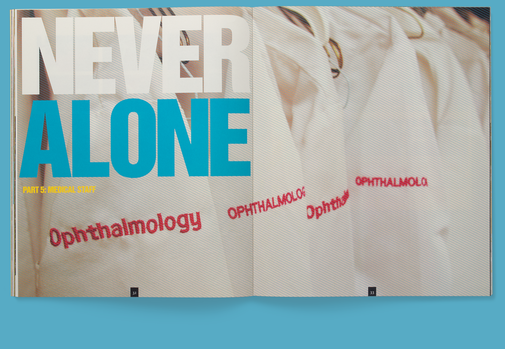
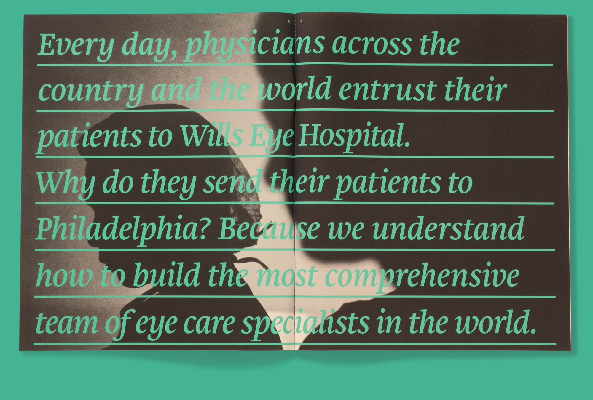
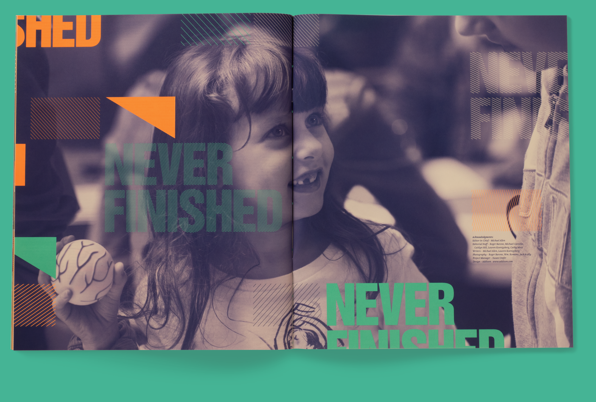
For their first major communications piece in eight years, the Wills Eye Institute wanted to make a bold statement. I used a positive spin on a negative word—Never—to grab readers’ attention. An oversized format, fluorescent color, and reportage-style photography then kept readers fully engaged.
The result is a standout that conveys the unflagging spirit of Wills Eye and tells, in no uncertain terms, of the critical, state-of-the-art work the institute performs.
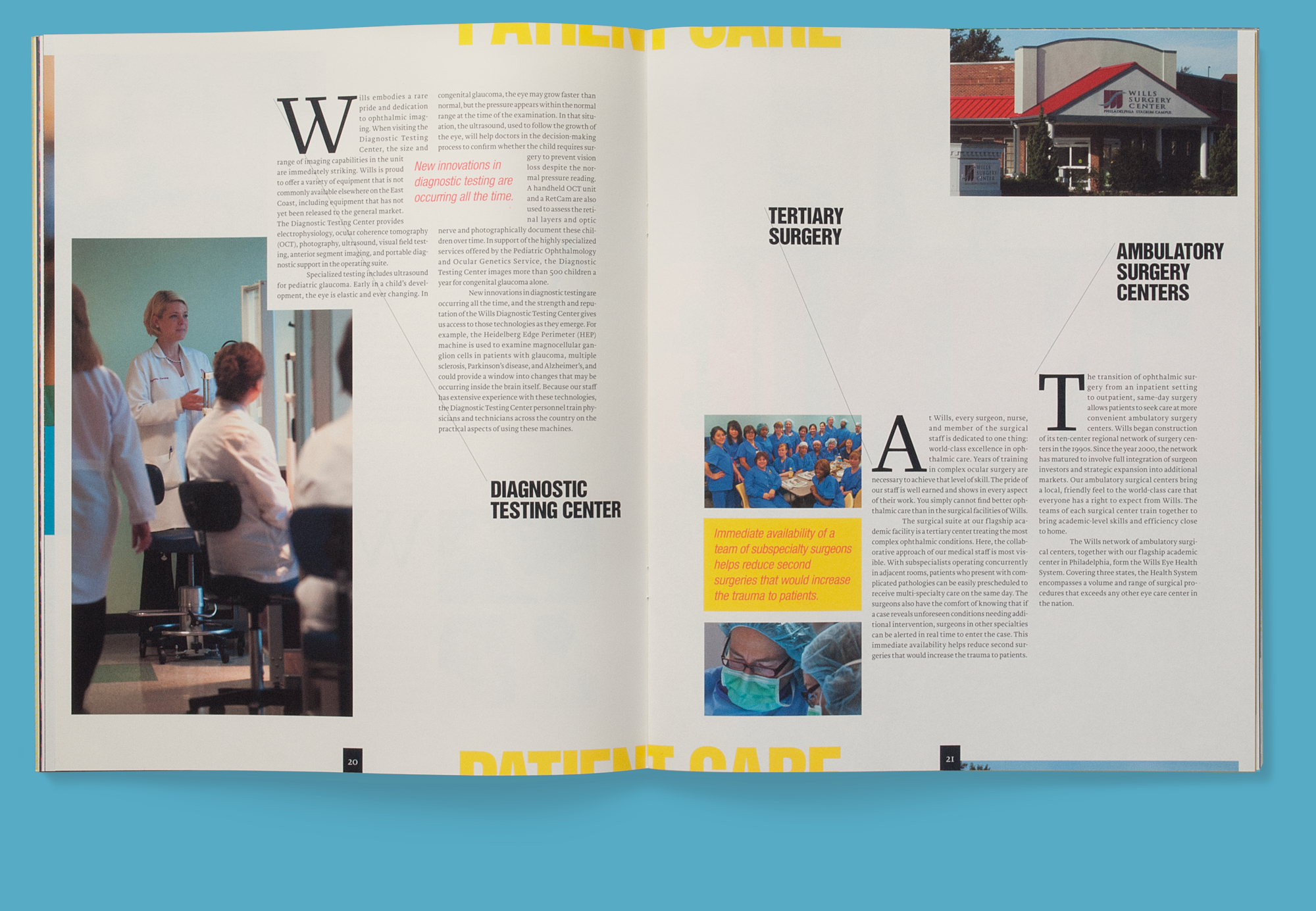
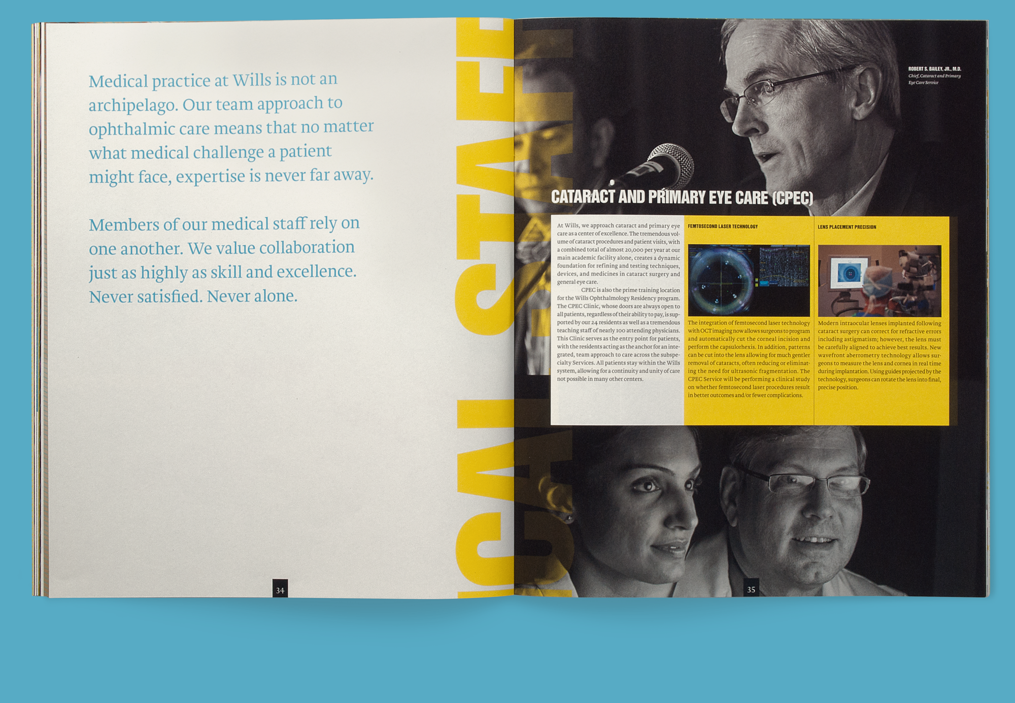
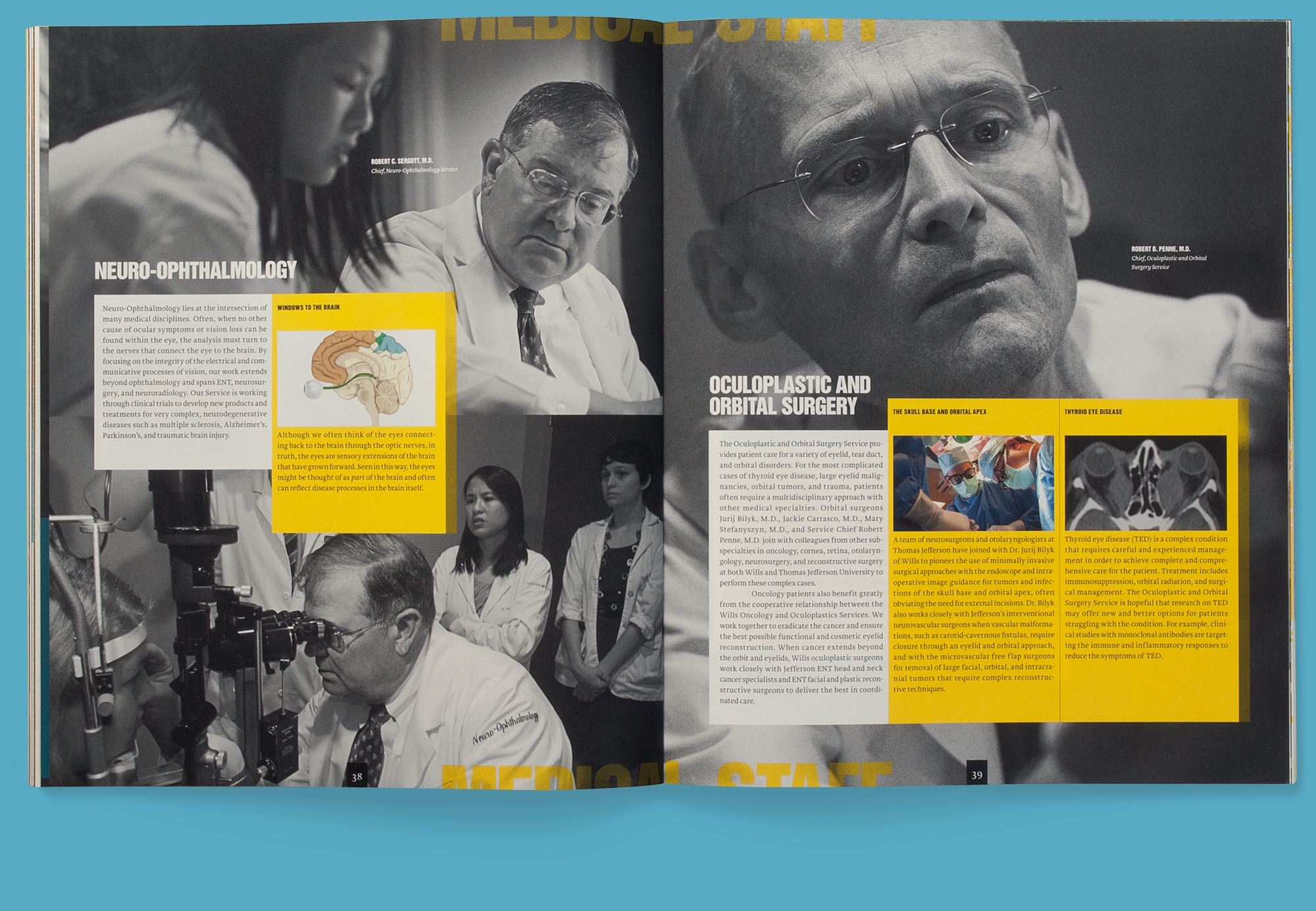
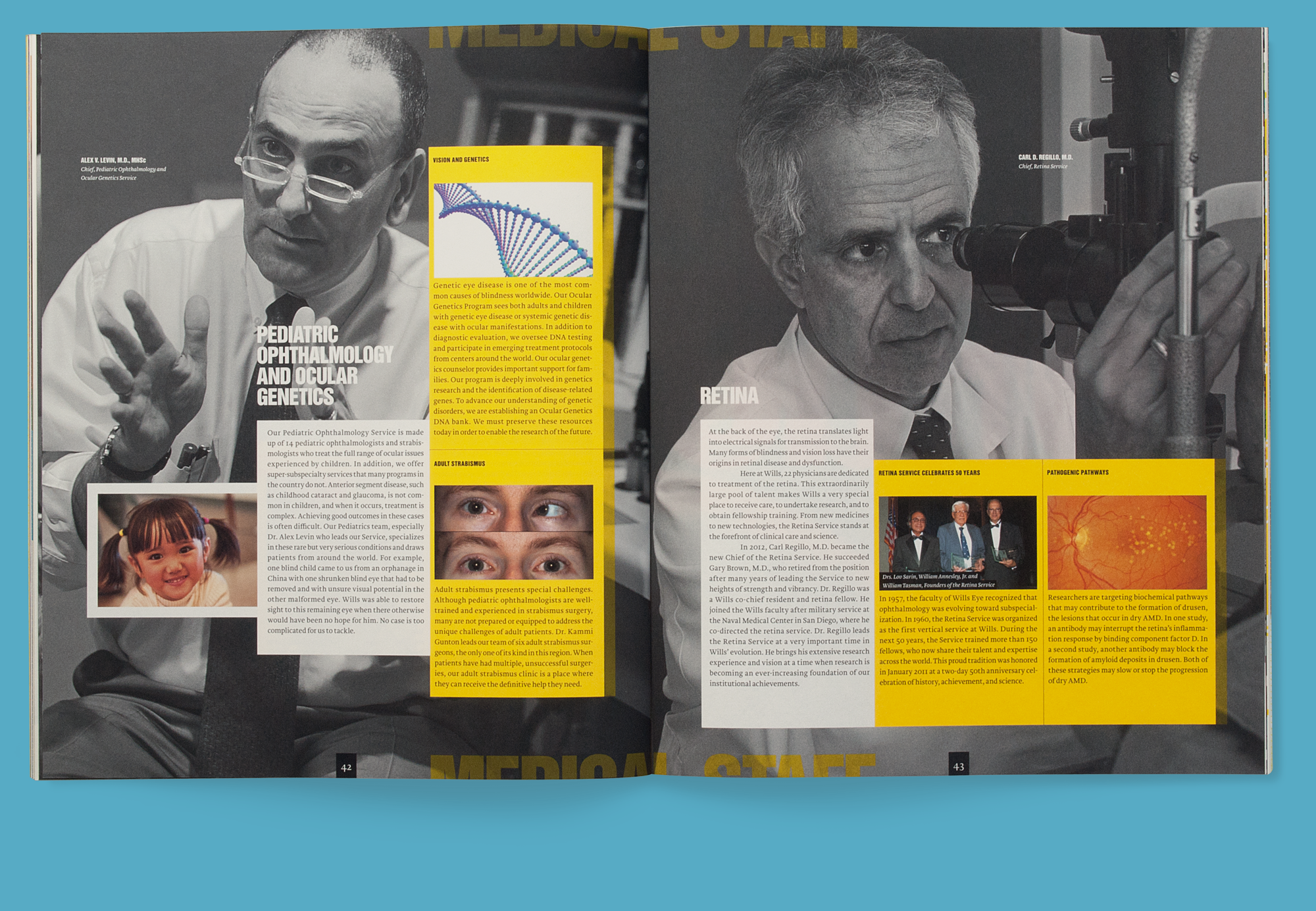
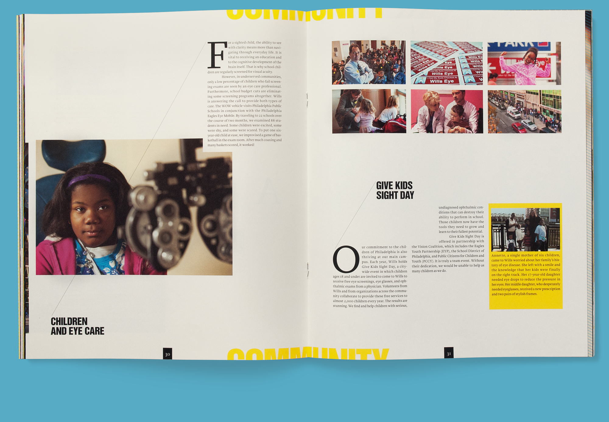

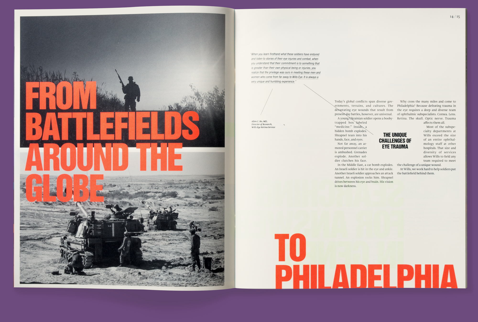
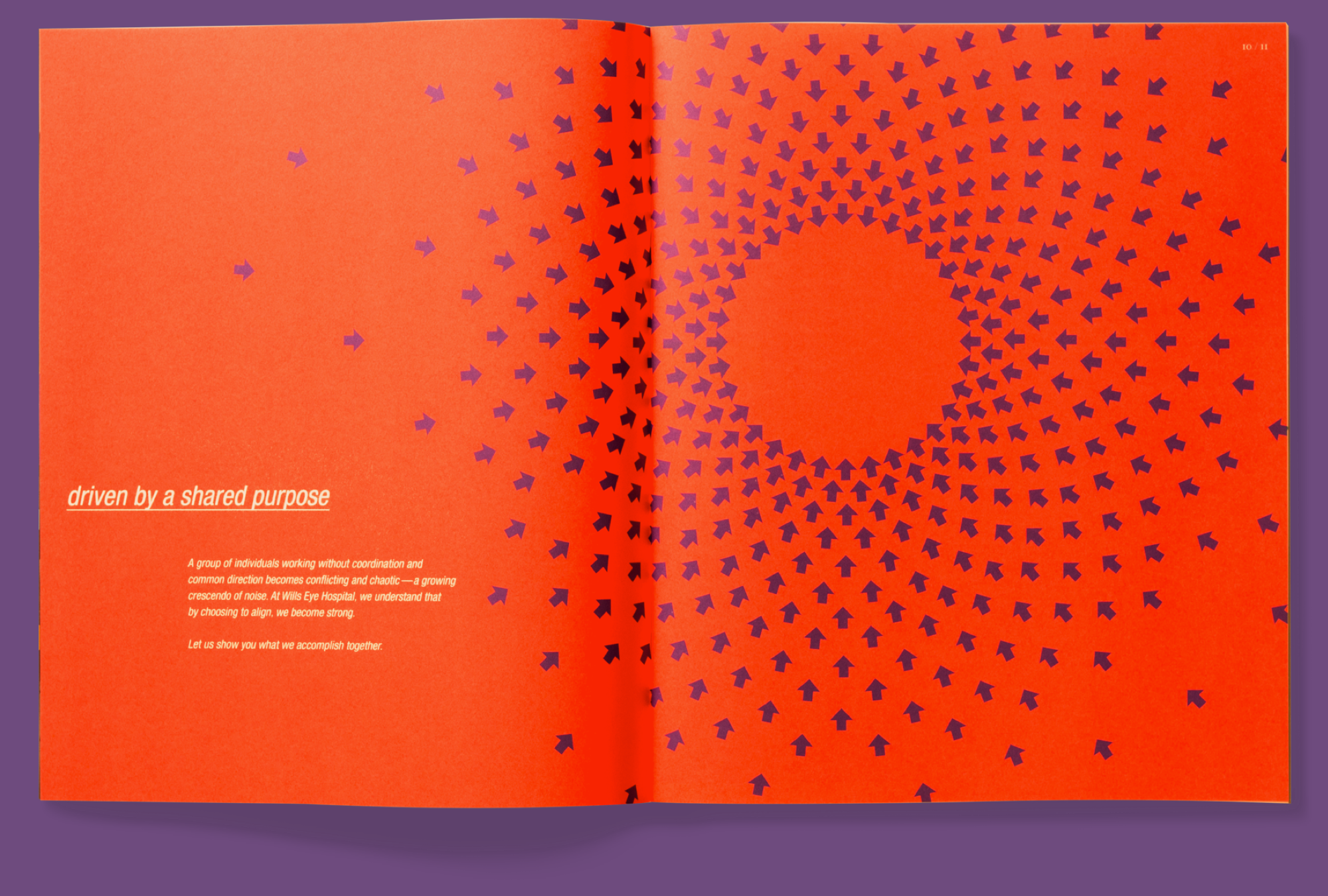
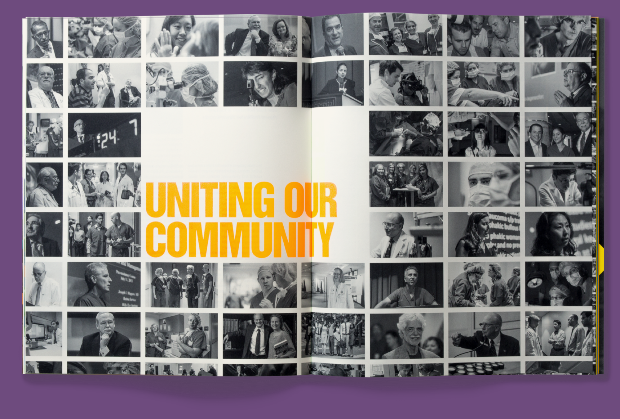
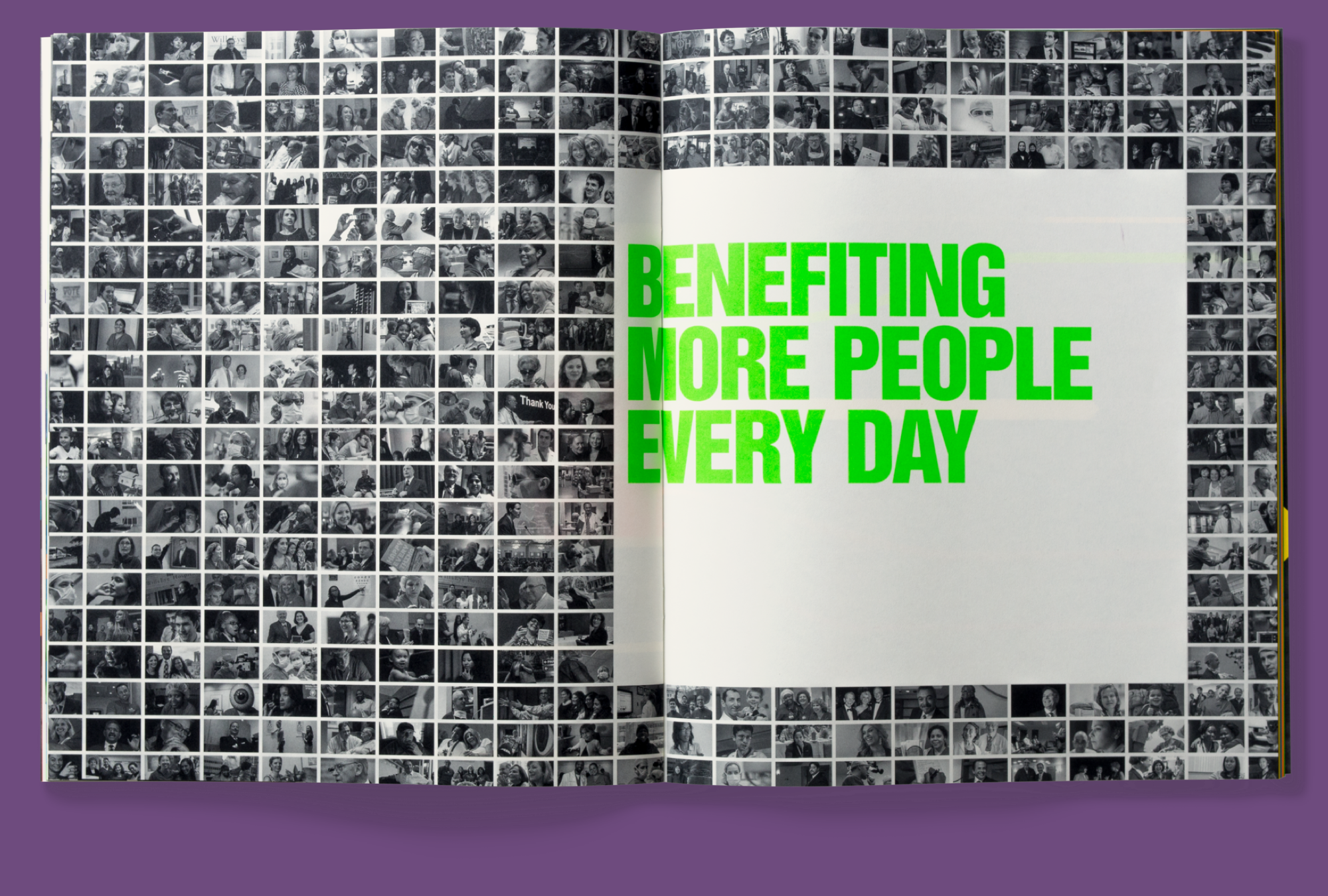
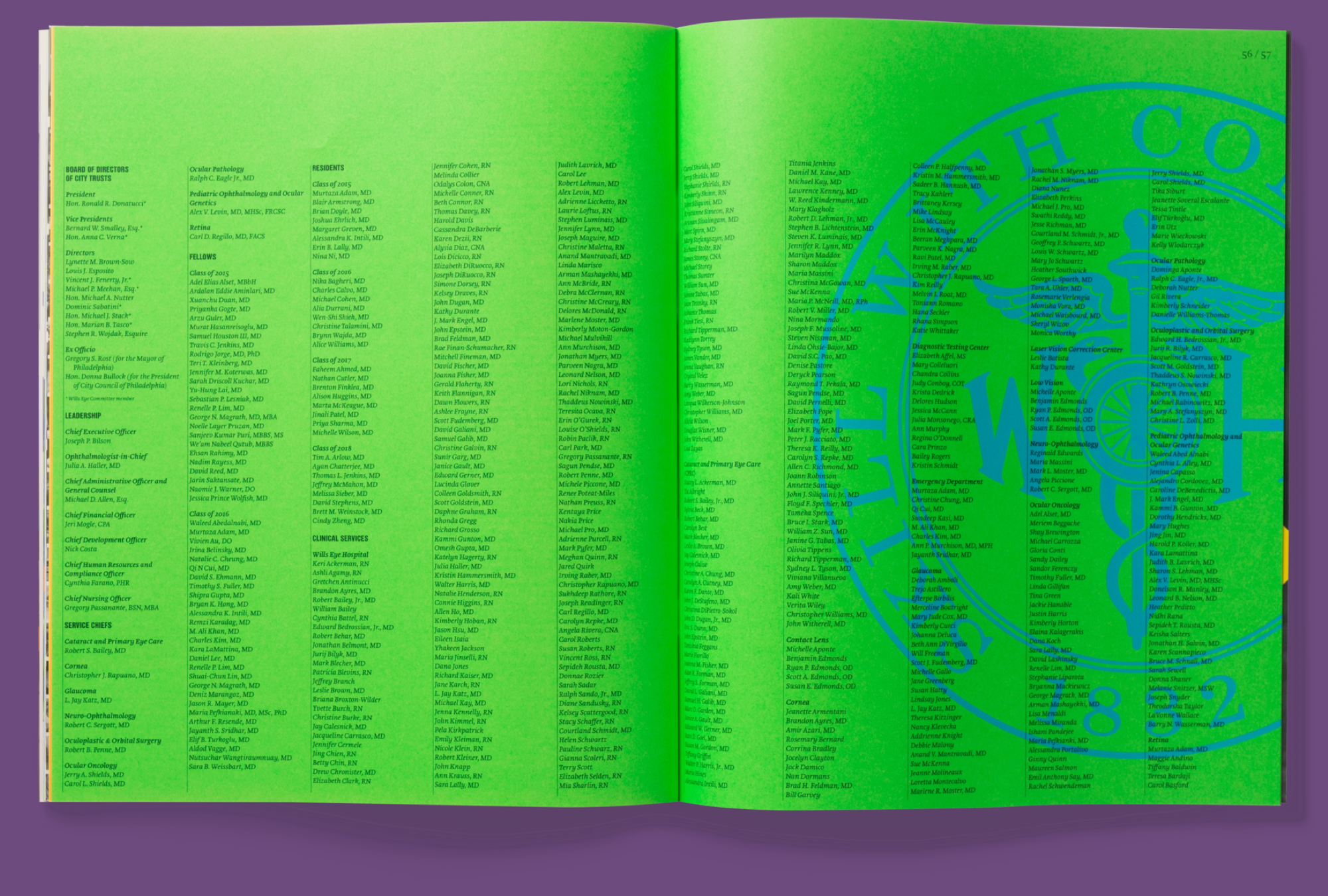
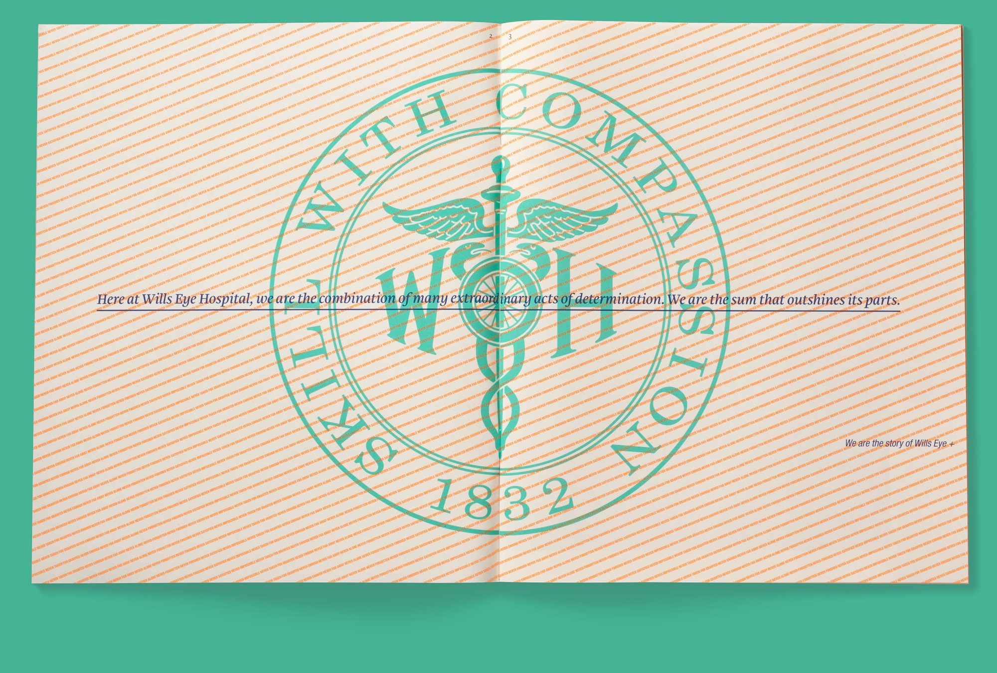
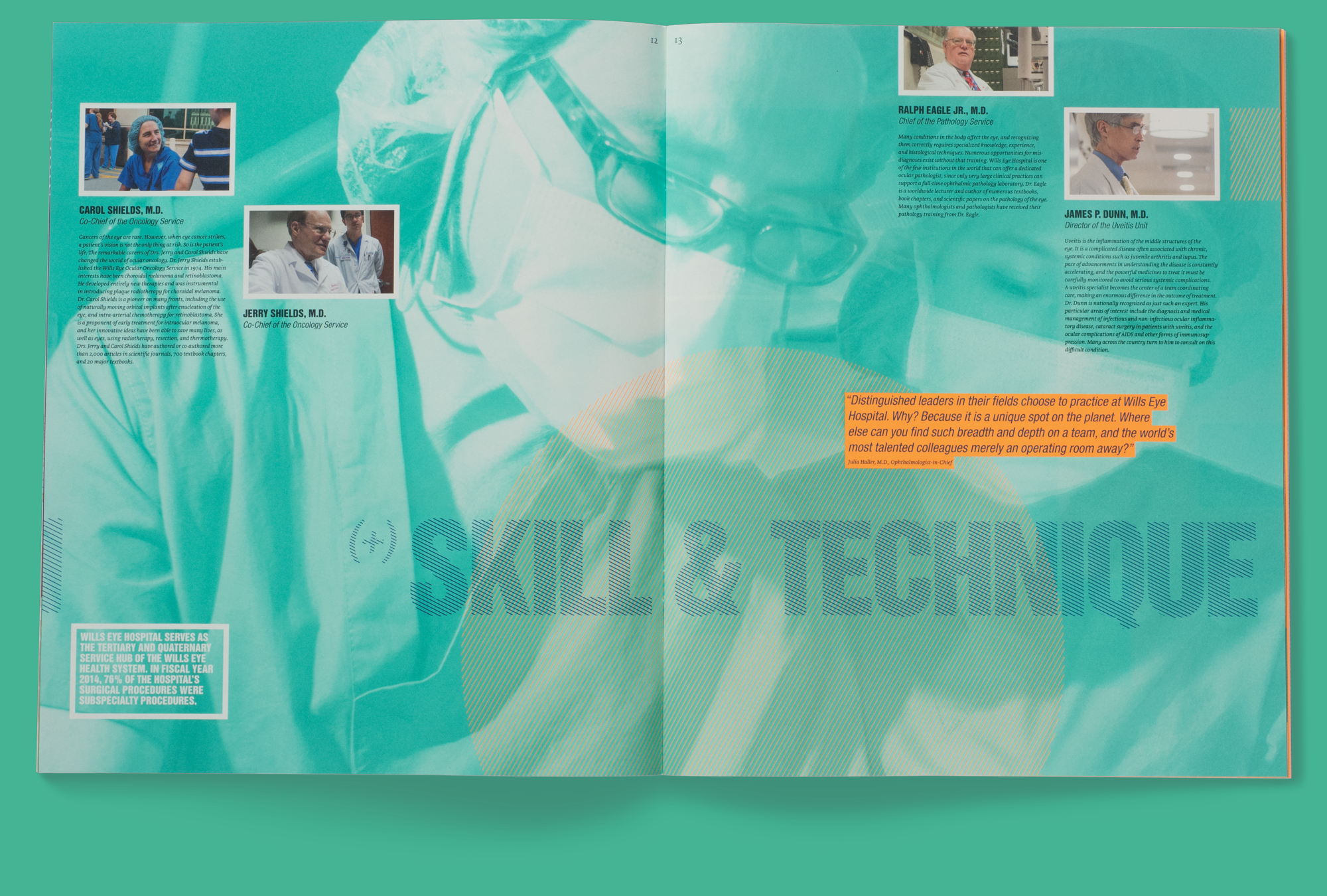
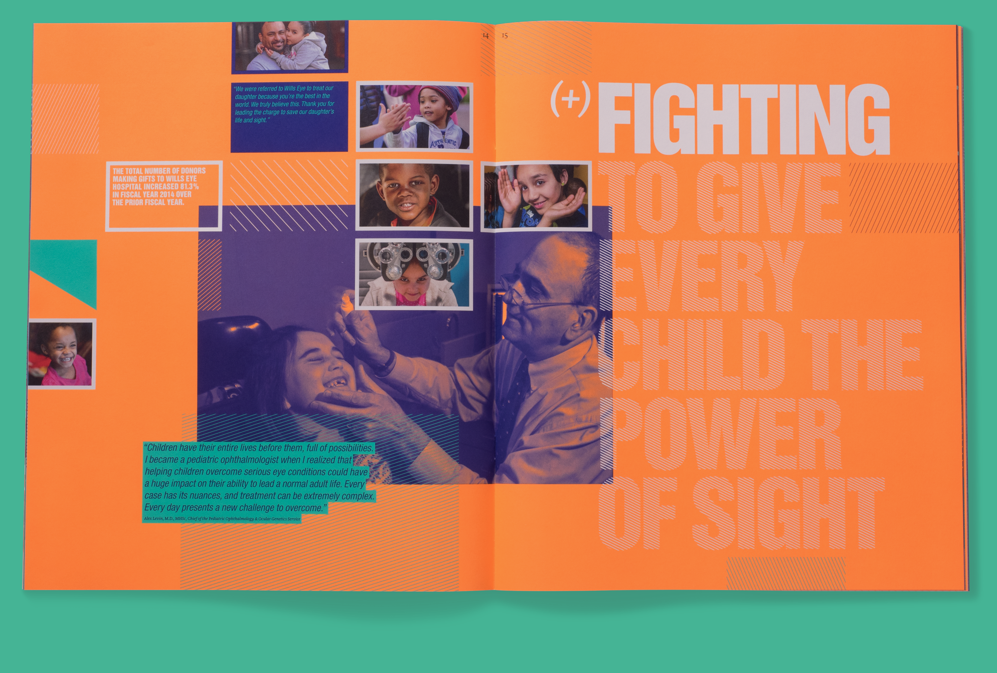
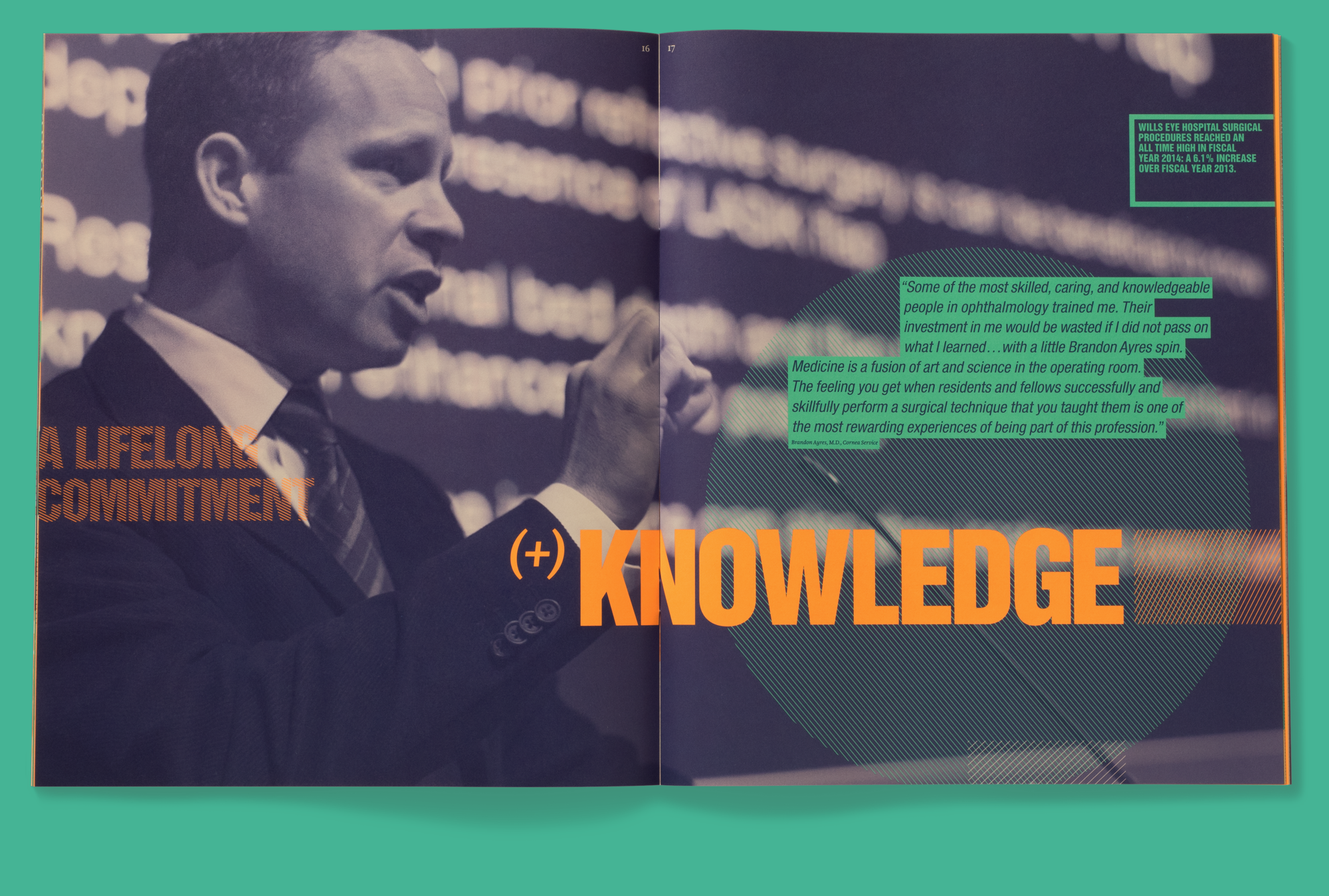
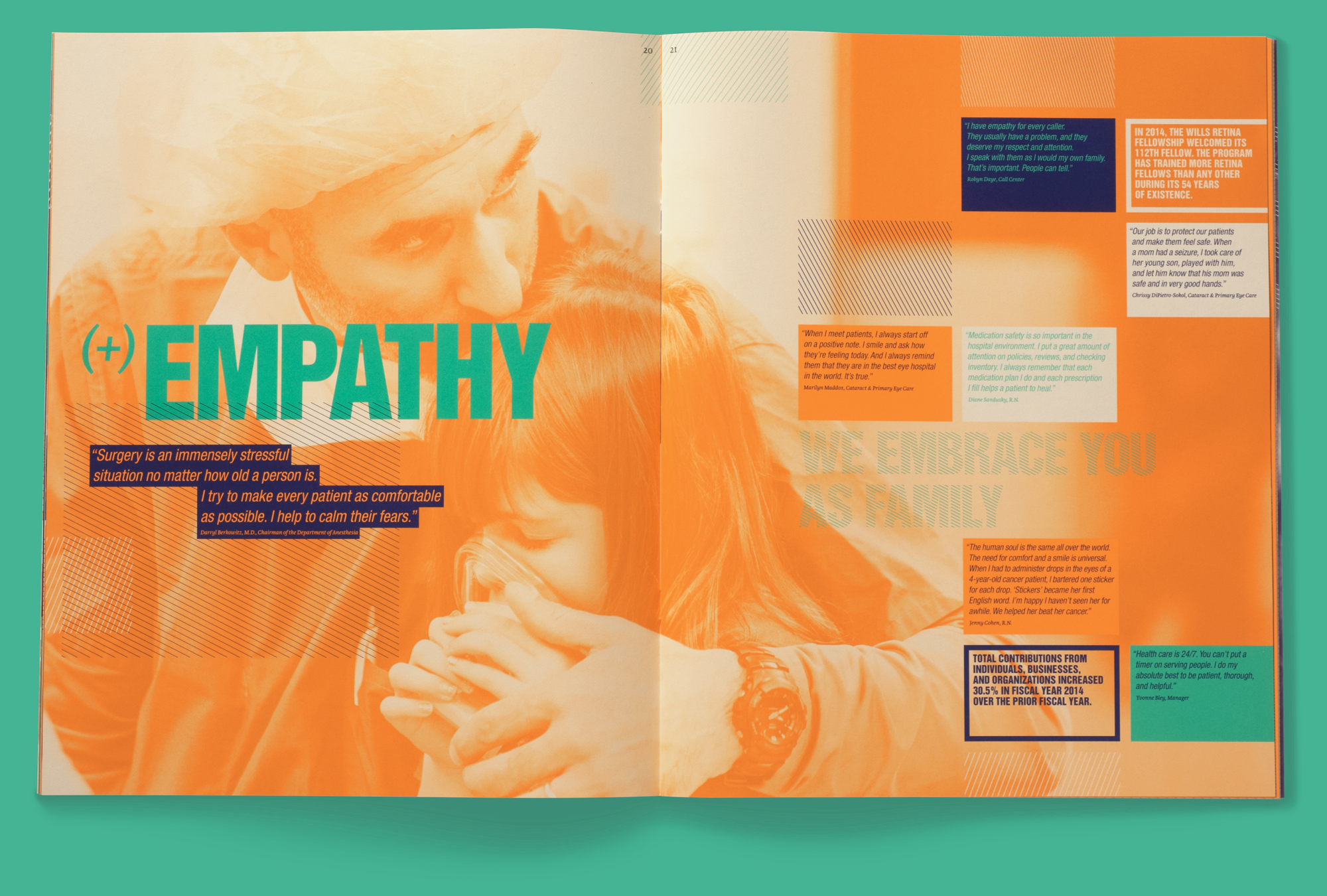
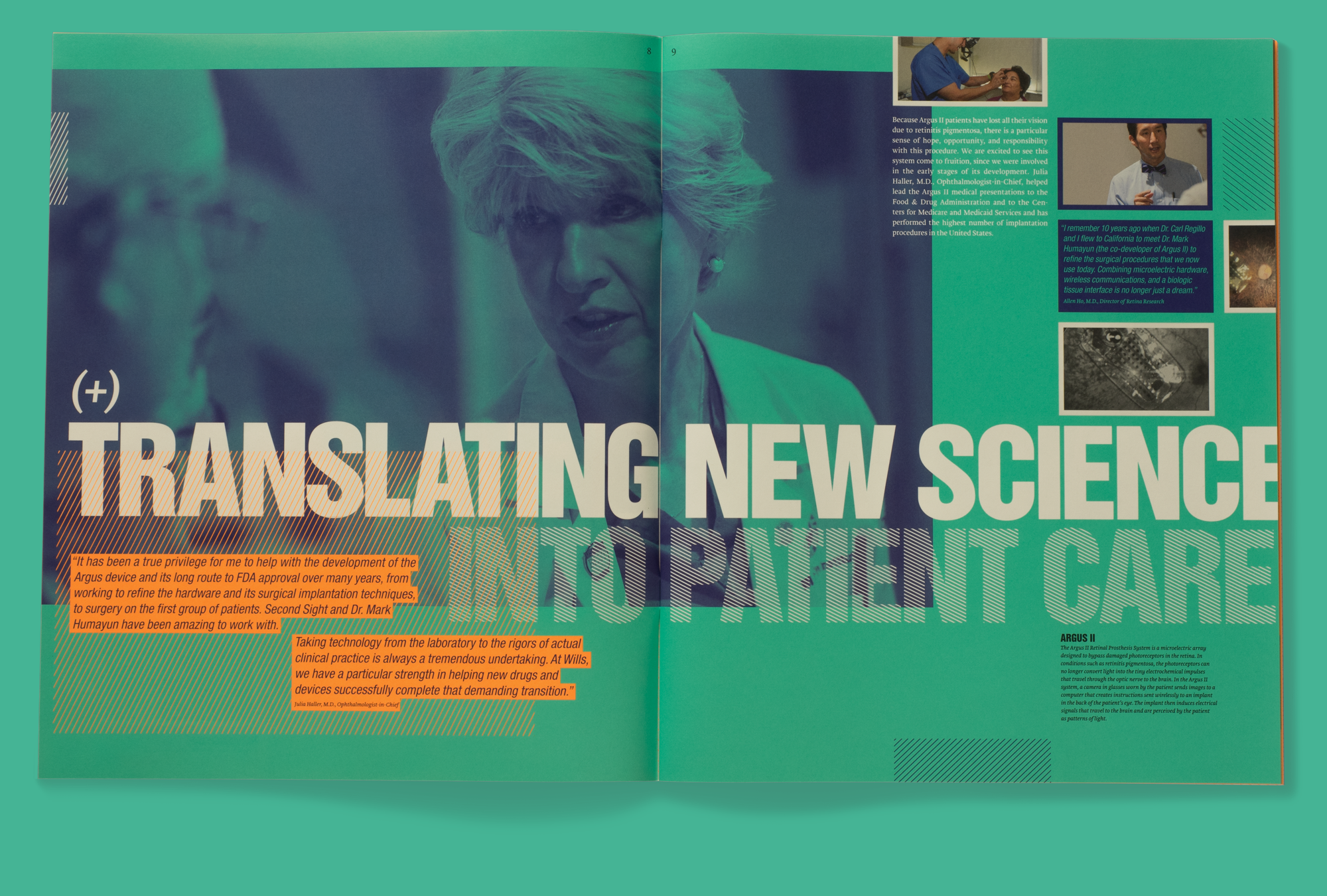
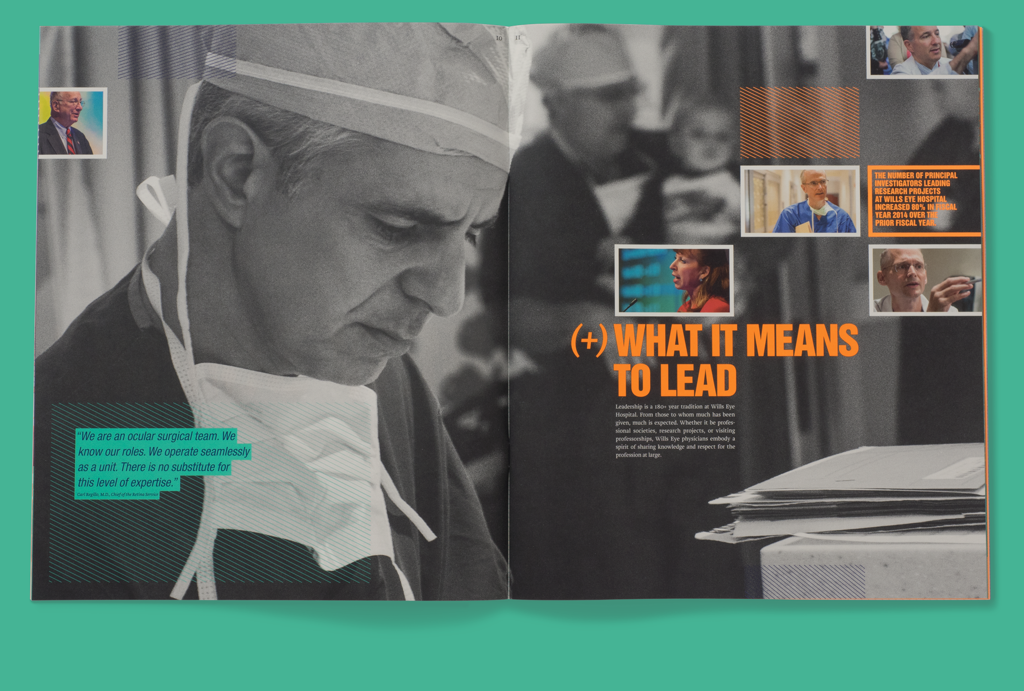
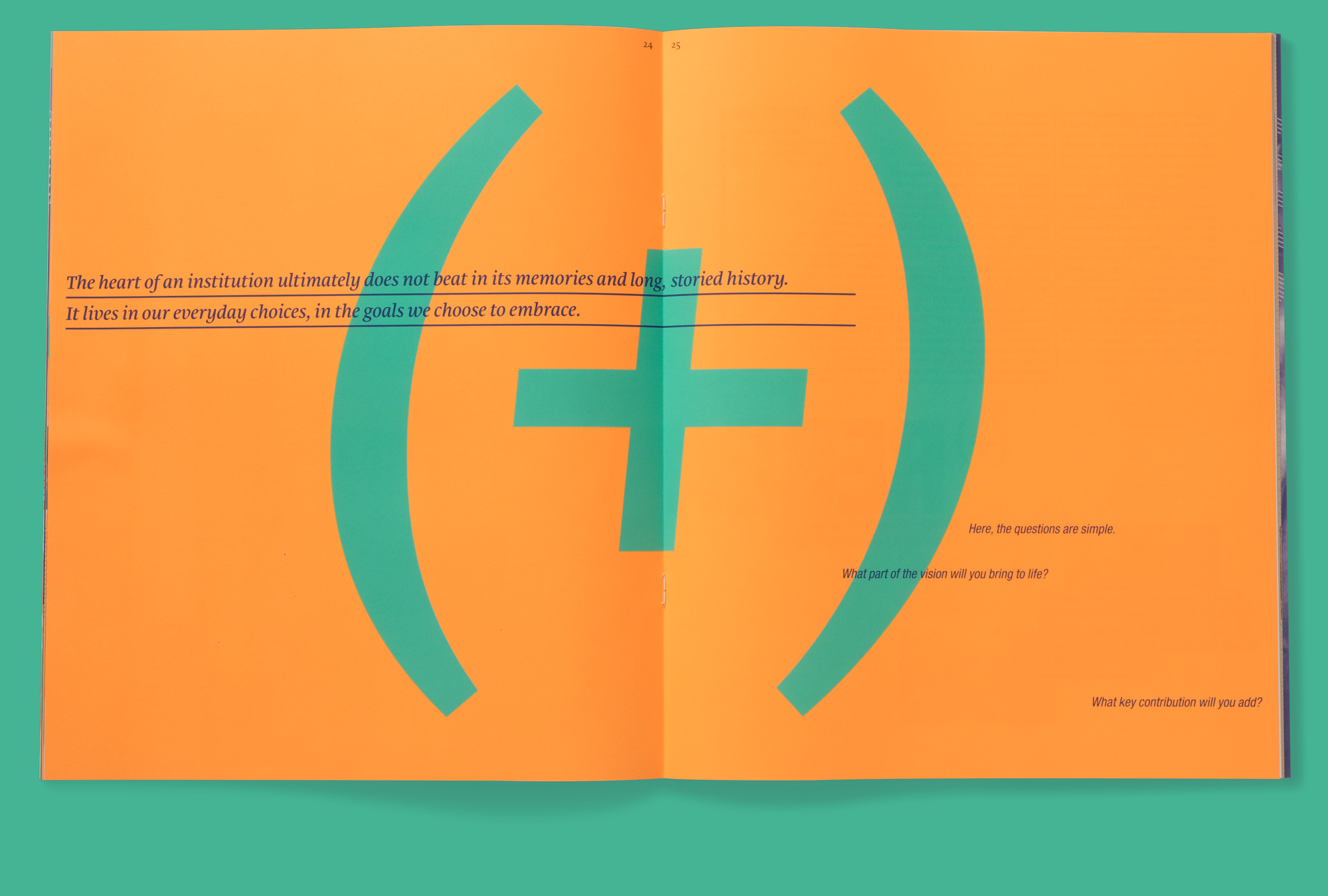
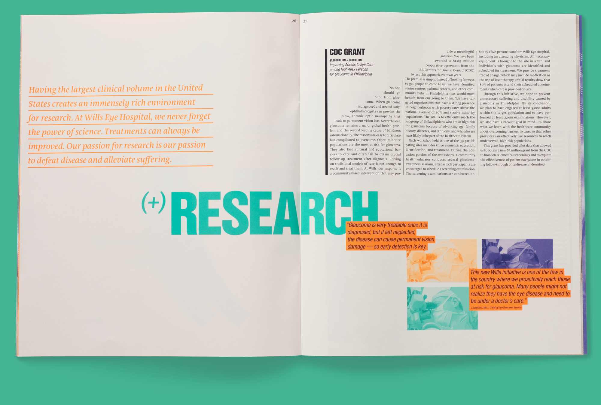
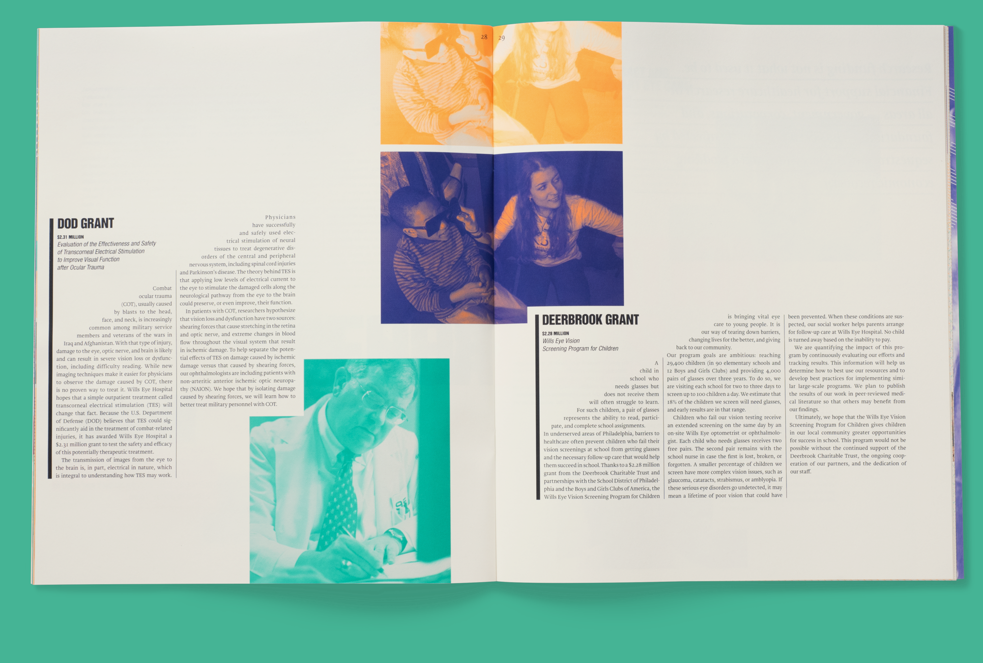
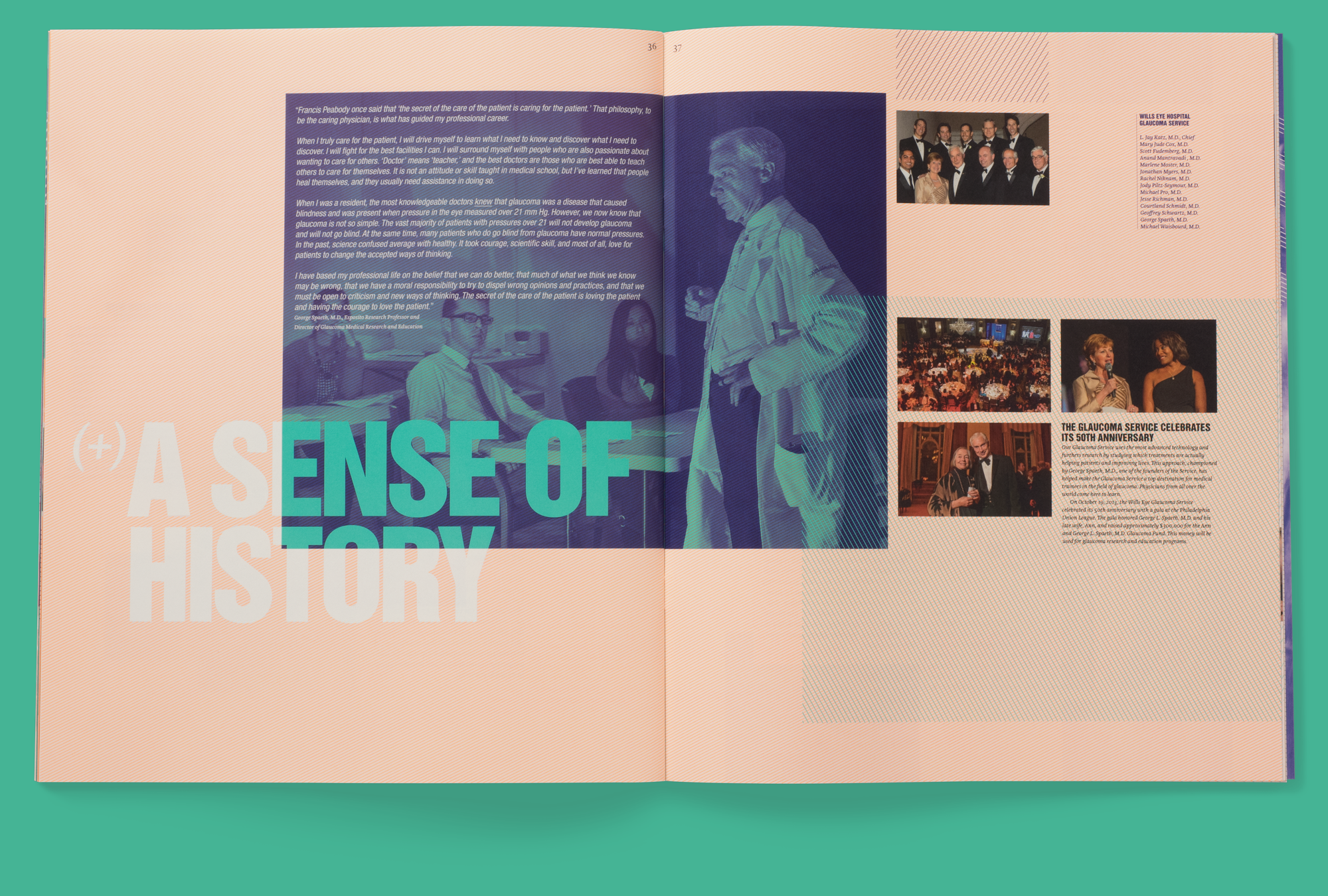
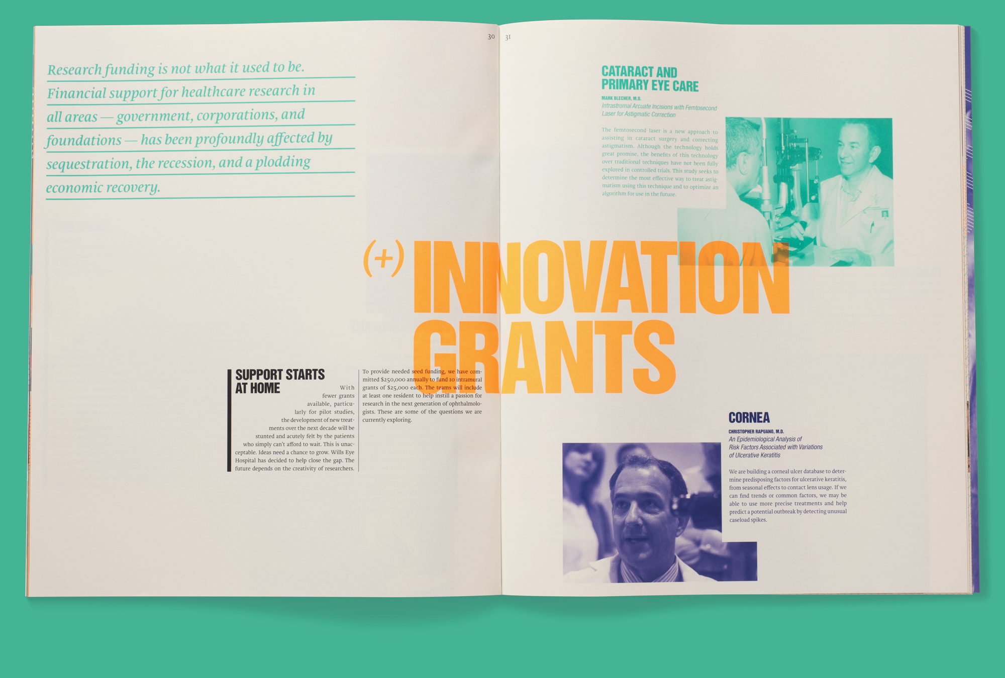
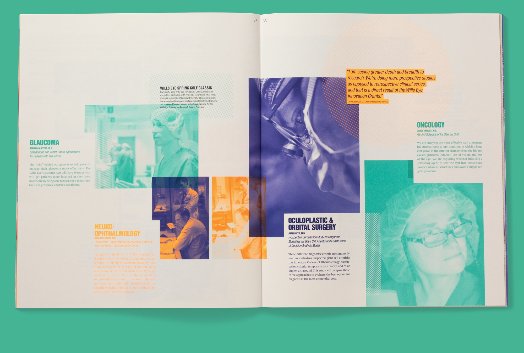
For their follow-up report, Wills Eye Hospital wanted to showcase their continual efforts to provide better care for their patients, increase their presence in the community, and advance the field of ophthalmology through research and education. We developed an “additive” solution (pun intended) that layered elements on top of each other in a frenetic, expressive style. With overlapping patterns, fluorescent colors, and bold typography throughout the book, more is definitely more.


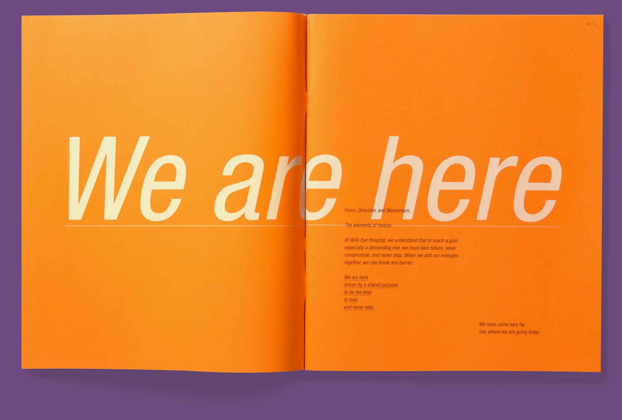
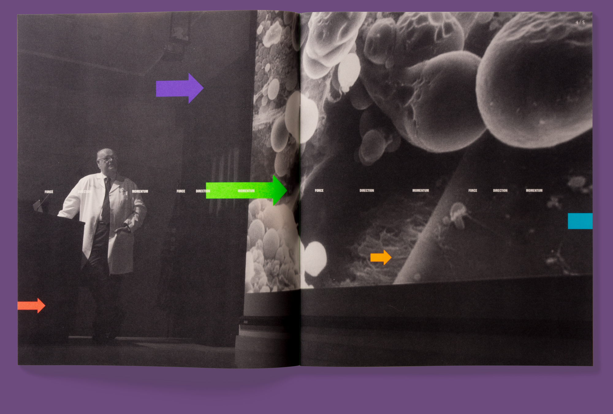
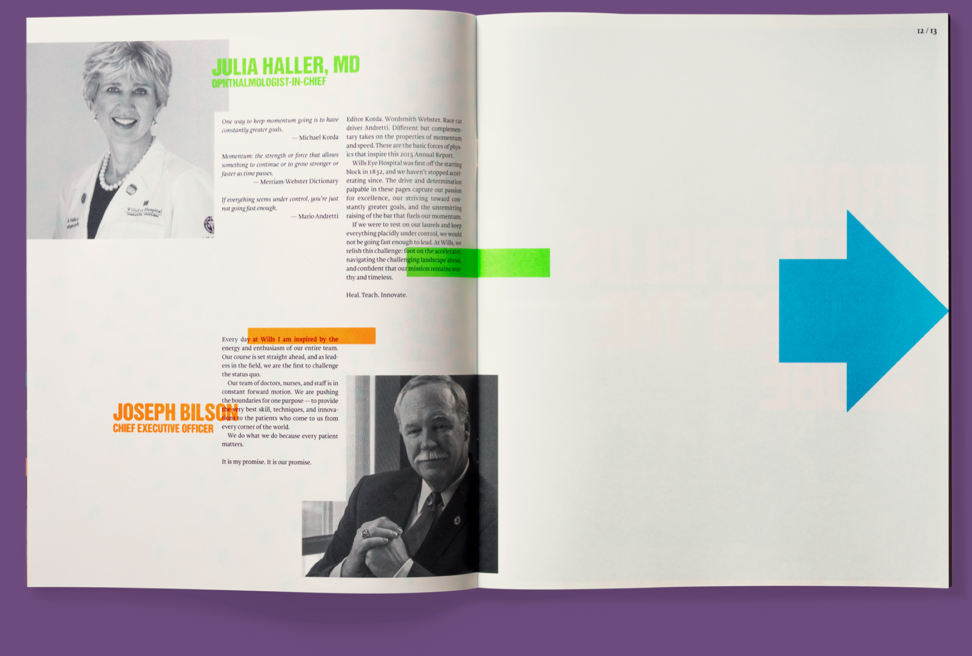
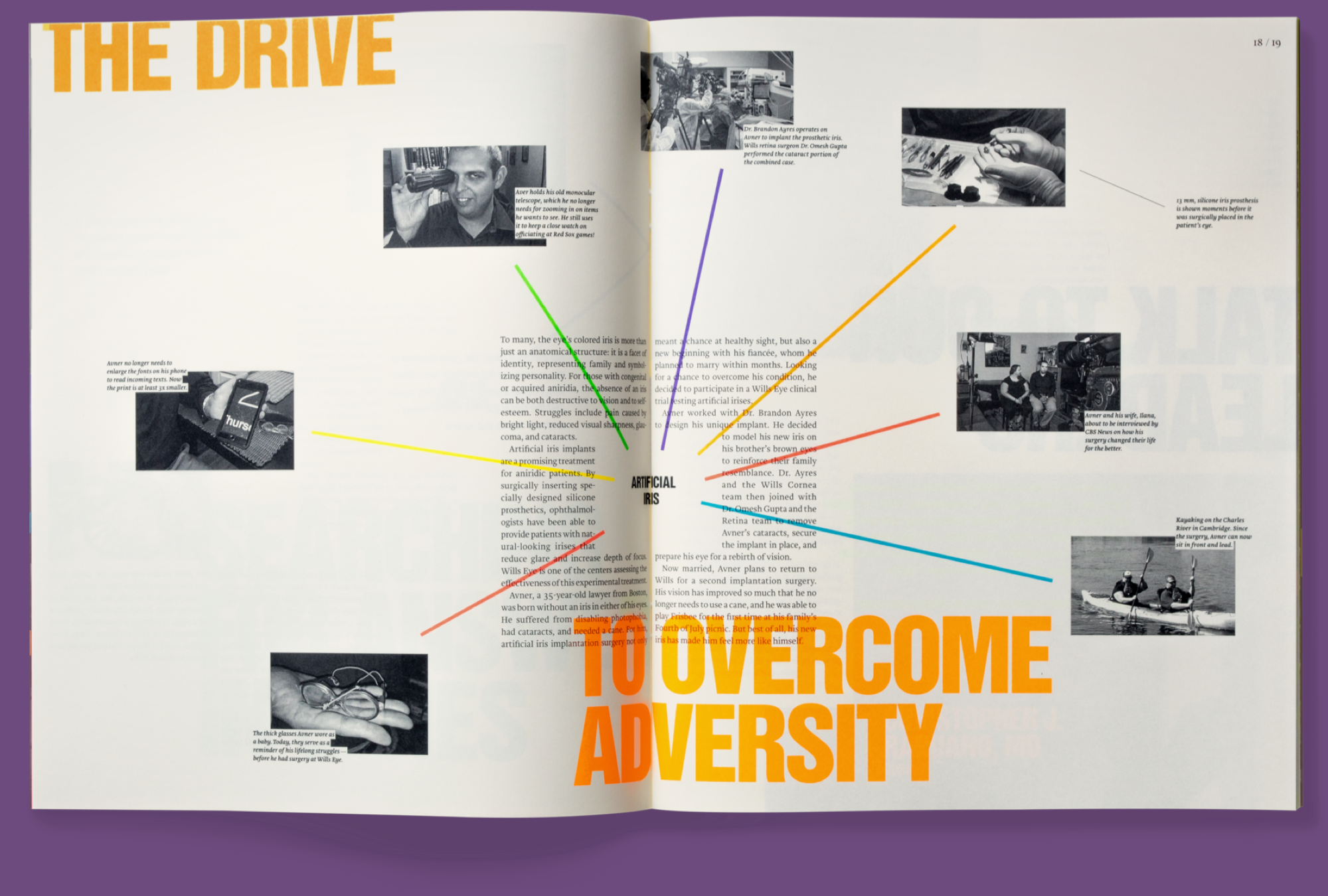
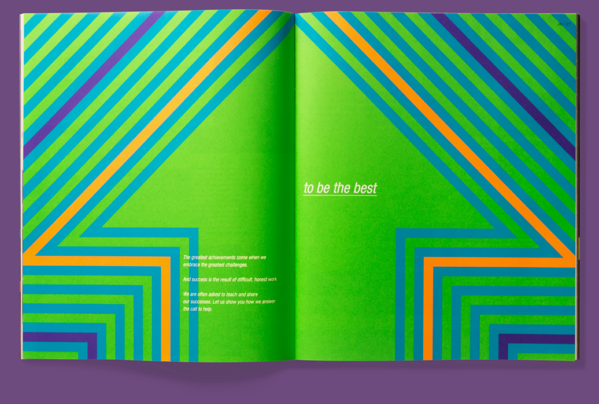
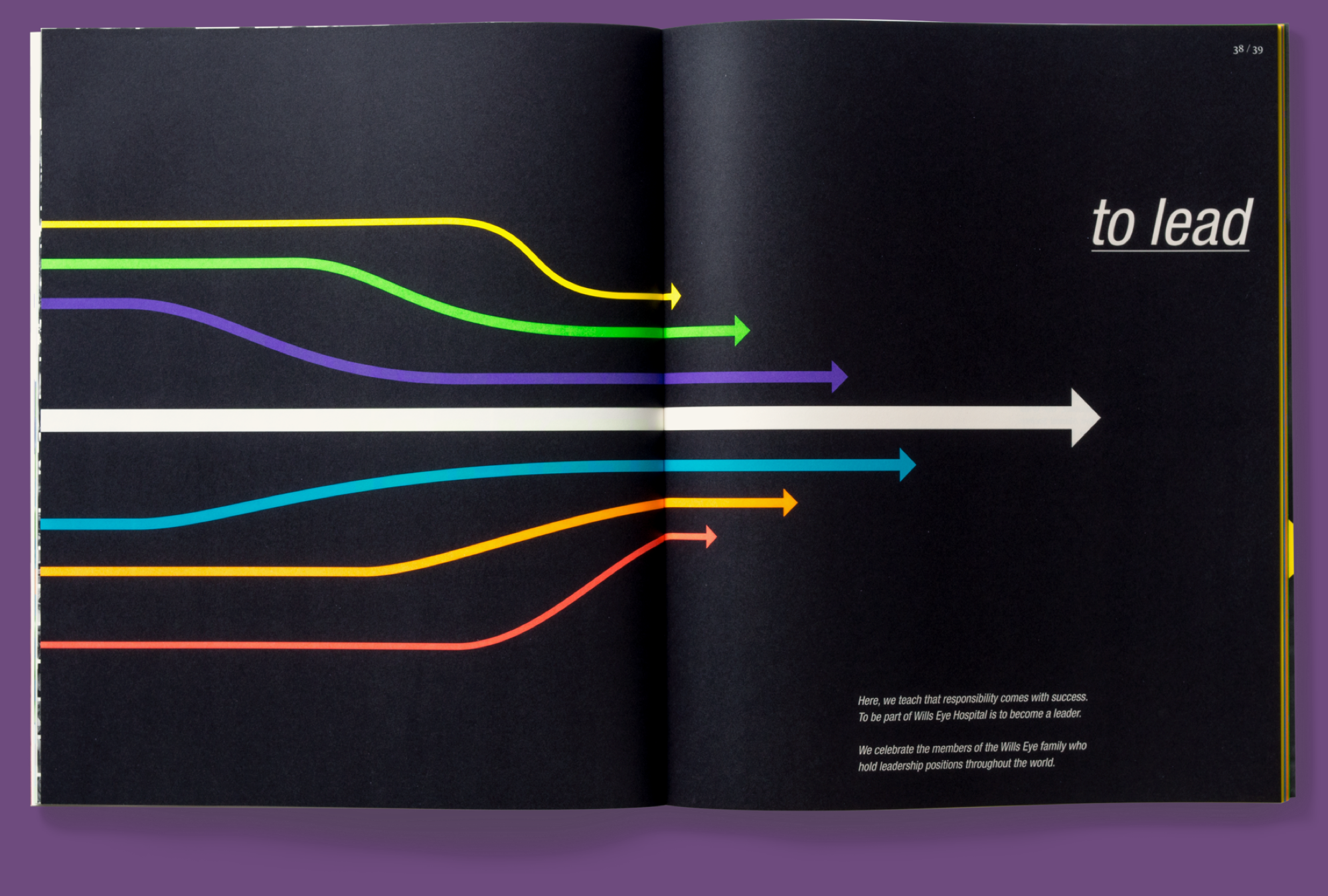
The third piece in the trilogy shows how Wills Eye is constantly moving their field forward. This brochure illustrates the hospital's trajectory through use of iconic, bold graphics, XL typography, and fluorescent colors. For this piece, we took full advantage of what the press had to offer – utilizing 6 different UV spot colors along with black process ink.