ecoATM
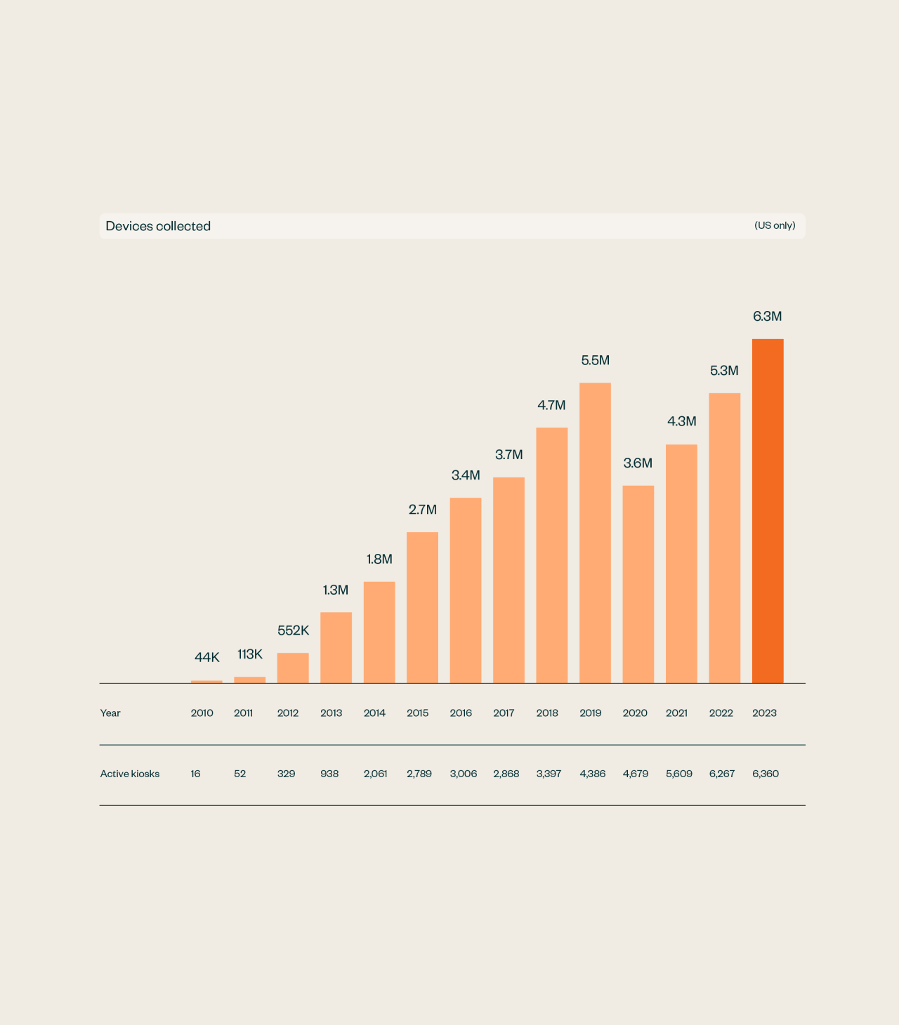
→ ecoATM is a technology recycler and upcycler that has kept over 40 million devices out of landfills. Their identity was in need a major update to modernize the brand experience and to better reflect a renewed focus on their mission of building a sustainable future, one device at a time.
-
Scope
Branding
Visual Identity
Digital


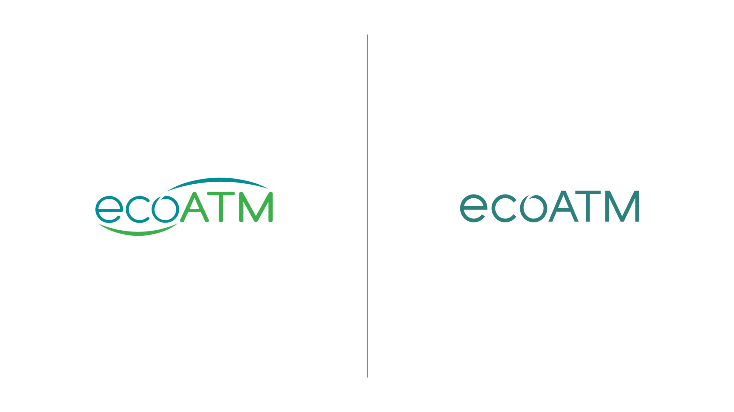
Old logo
New logo
With over 5,000 physical kiosks in use, it was essential that changes to the logo were evolutionary instead of revolutionary, as the brand would be rolled out over an extended period of time. So we kept the basic structure of the mark, but simplified and refined everything about it.


The concept of Refreshing Clarity became the creative driver behind the visual identity — guiding the work and creating a consistent expression of the brand’s look and feel throughout every touchpoint.


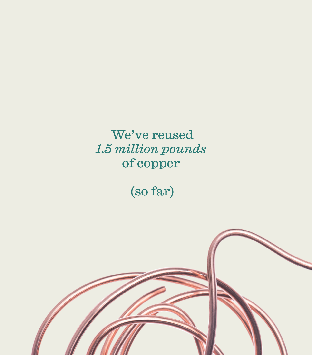

We developed a flexible system of imagery and graphics, that allow for playful infographics, abstracted nature, issue-driven photojournalism, and aspirational renderings.